The data visualization market is set to hit nearly $20 billion by 2031. This growth is driven by businesses wanting to use the vast data they collect. Data visualization makes it easy for non-tech folks in companies to get insights from data1. As we move towards 2024-2025, we’ll dive into the newest trends and methods. These include making data more accessible, real-time analysis, and using animation and interactivity.
Data Visualization Techniques for Research in 2024-2025
Introduction
As we move into 2024-2025, data visualization continues to play a crucial role in research across all disciplines. With the increasing complexity of data and the need for clear communication of research findings, innovative visualization techniques are more important than ever. This guide explores the latest trends and most effective techniques for data visualization in research for the 2024-2025 period.
Key Trends in Data Visualization (2024-2025)
- Interactive and Immersive Visualizations: Leveraging VR and AR technologies for data exploration.
- AI-Assisted Visualization: Using machine learning to generate and optimize visualizations.
- Real-time Data Visualization: Techniques for visualizing streaming and constantly updating data.
- Accessibility-Focused Design: Ensuring visualizations are inclusive and understandable for diverse audiences.
- Ethical Data Representation: Emphasizing fair and unbiased visual representations of data.
Advanced Visualization Techniques
1. Dynamic Network Graphs
Ideal for visualizing complex relationships and their evolution over time in fields like social sciences, biology, and computer science.
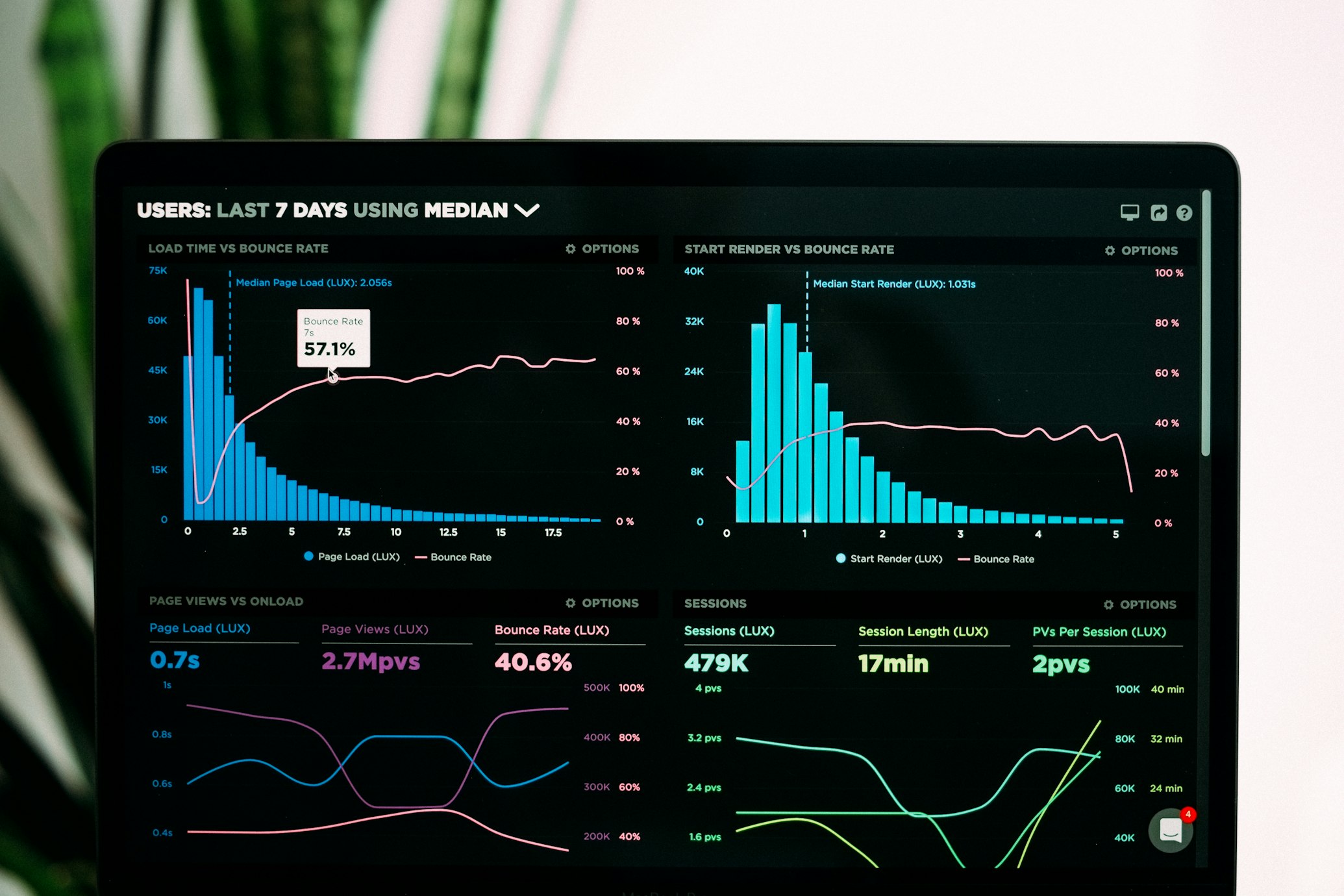
Figure 1: Example of a Dynamic Network Graph visualization
2. 3D Data Visualization
Useful for representing multidimensional data in fields like physics, chemistry, and earth sciences.

Figure 2: Example of a 3D Data Visualization
3. Augmented Reality (AR) Data Visualization
Emerging technique for overlaying data visualizations on real-world environments, particularly useful in fields like architecture, archaeology, and medical research.

Figure 3: Concept of Augmented Reality Data Visualization
4. Interactive Dashboards
For creating comprehensive, interactive views of complex datasets, popular in business research, public health, and social sciences.
Figure 4: Example of an Interactive Dashboard
5. Geospatial Visualization
Advanced techniques for visualizing geographical data, crucial in environmental science, urban planning, and epidemiology.

Figure 5: Example of a Geospatial Visualization
Best Practices for Research Visualization (2024-2025)
1. Prioritize Clarity and Accuracy
Ensure that your visualizations accurately represent the data without distortion. Clarity should always take precedence over complexity or aesthetic appeal.
2. Design for Accessibility
Use color schemes that are accessible to color-blind individuals. Provide alternative text descriptions for complex visualizations.
3. Leverage Interactivity
Where possible, create interactive visualizations that allow users to explore the data themselves, revealing additional layers of information.
4. Contextualize Your Data
Provide necessary context and explanations alongside your visualizations to ensure proper interpretation.
5. Embrace Storytelling
Use visualization techniques that help tell a coherent story with your data, guiding the viewer through your research narrative.
Comparison of Visualization Tools (2024-2025)
| Tool | Best For | Learning Curve | Interactivity |
|---|---|---|---|
| Python (Matplotlib, Seaborn) | Customizable static plots | Moderate | Limited |
| R (ggplot2) | Statistical visualizations | Moderate | Limited |
| D3.js | Highly interactive web visualizations | Steep | Excellent |
| Tableau | Quick, interactive dashboards | Easy | Good |
| Power BI | Business intelligence integration | Moderate | Good |
Conclusion
As we look towards 2024-2025, data visualization in research is becoming increasingly sophisticated, interactive, and accessible. By leveraging these advanced techniques and tools, researchers can more effectively communicate complex findings, explore data in new ways, and make their work more engaging and understandable to both peers and the general public. The key lies in choosing the right visualization technique for your data and research questions, while adhering to best practices in clarity, accuracy, and ethical representation.
Further Resources
- “Advanced Data Visualization for Research” – Online Course
- Journal of Data Visualization in Science – Special Issue on Emerging Techniques
- “Ethical Considerations in Data Visualization” – Guidelines and Best Practices
- Python for Scientific Visualization – Comprehensive Tutorial Series
- Interactive Data Visualization Web-based Tools for Researchers – Comparison and Guide
We’ll also look at how social media and storytelling with data are changing the game. These changes will make research stand out.
Key Takeaways
- The data visualization market is expected to reach $20 billion by 2031 as businesses leverage data insights.
- Upcoming conferences will showcase the latest trends in data visualization, including data democratization and real-time analysis.
- Researchers can enhance their work through interactive, animated, and socially-driven data visualizations.
- Data storytelling will play a crucial role in effectively communicating research findings.
- Mastering data visualization tools and software will be essential for researchers in 2024-2025.
Upcoming Data Visualization Conferences in 2024-2025
The list of conferences for 2024 and 2025 is growing, focusing on data visualization. It includes both popular and academic events. Key events are the Electronic Visualisation & the Arts Conference in London (July 2024)2, IEEE VIS 2024 in St. Pete’s Beach, Florida (October 2024), and the International Conference on Information Visualization Theory and Applications 2025 in Porto, Portugal (February 2025). These conferences will highlight new trends in data visualization, like artificial intelligence and the metaverse.
Electronic Visualisation & the Arts Conference, London (July 2024)
The Electronic Visualisation & the Arts Conference is a top event for data visualization, art, and tech experts. It’s a place for innovation, where data, creativity, and human experience meet. Attendees will enjoy presentations, workshops, and networking with top industry figures.
IEEE VIS 2024, St. Pete’s Beach, Florida (October 2024)
IEEE VIS 2024 is a big event for data visualization fans, happening in beautiful St. Pete’s Beach, Florida. It’s known for its cutting-edge research and the latest in data visualization tools and techniques2. There will be a career advice track, an IRE mentorship program breakfast, and a Tools & Tech track full of insights.
International Conference on Information Visualization Theory and Applications 2025, Porto, Portugal (February 2025)
The International Conference on Information Visualization Theory and Applications 2025 is set in Porto, Portugal. It’s a key event for those into data visualization, offering a chance to share ideas, collaborate, and explore new trends.
| Conference | Location | Date |
|---|---|---|
| Electronic Visualisation & the Arts Conference | London | July 2024 |
| IEEE VIS 2024 | St. Pete’s Beach, Florida | October 2024 |
| International Conference on Information Visualization Theory and Applications 2025 | Porto, Portugal | February 2025 |
These conferences are key for data visualization pros, researchers, and fans to learn about new trends, techniques, and innovations. Whether you’re into art and tech, the latest in info visualization, or practical data visualization uses, these events offer great insights and networking chances.
Data Democratization and No-Code/Low-Code Solutions
In today’s world, data democratization is key for businesses. A recent survey showed that 90% of leaders see it as a top priority3. This means giving employees at all levels the power to use, analyze, and see data. This change is thanks to no-code and low-code solutions.
Tools like Opendatasoft and Tableau Public lead this change. They let both companies and citizens use data visualization easily, even without complex skills3. These tools are changing how we make data-driven decisions. They’re making a culture of data literacy and data accessibility in companies.
With these data experience platforms, people can make beautiful visualizations and find important insights. They can make big decisions without needing IT help or special data analysts3. This change is big, letting everyone at all levels join the data revolution.
| Course | Credits |
|---|---|
| L IS 407: Data Storytelling with Visualization | 3 |
| L IS 440: Navigating the Data Revolution: Concepts of Data & Information Science | 3 |
| L IS/AFRICAN/COM ARTS 444: Technology and Development in Africa and Beyond | 3 |
| L IS/LEGAL ST 460: Surveillance, Privacy, and Police Powers | 3 |
| L IS 461: Data and Algorithms: Ethics and Policy | 3-4 |
| L IS 464: Applied Database Design | 3 |
| L IS 470: Interaction Design Studio | 3 |
The need for easy and user-friendly data tools is growing. The future of data visualization and analysis looks set to be more open, team-based, and empowering3. By following data democratization, companies can use their data fully. They can empower their employees to make informed decisions and innovate.
“The future of data visualization and analysis is poised to become more inclusive, collaborative, and empowering than ever before.”
Real-Time Data Visualization and Analysis
In today’s fast-paced business world, getting insights from data right away gives companies a big edge. A recent survey found that 78% of people see real-time data as essential. Also, 71% believe it helps increase revenue. Real-time data visualization is key in fields like logistics and shipping. Here, it helps track shipments, monitor delivery times, and spot issues4.
Real-Time Visualization in Logistics and Shipping
Logistics and shipping firms use real-time data visualization to boost their operations and serve customers better. They combine data from IoT sensors, GPS trackers, and enterprise systems. This lets them create dashboards that show the whole supply chain. With this real-time analysis, they can make quick decisions, handle disruptions fast, and work more efficiently4.
Real-Time Visualization for Public Applications
Real-time data visualization isn’t just for the private sector. Public places like universities are using it too. For instance, some universities help autistic students with real-time sensor data visualization. They map things like crowd patterns and noise levels. This helps give personalized advice and makes campus life better for students with sensory issues. Real-time data analysis in public areas means better access, smarter use of resources, and quicker decisions5.
As the need for real-time insights grows, companies and groups are adopting new data visualization techniques. They use dynamic dashboards and live data analysis to stay ahead and serve their customers or people better. This leads to better decisions, smoother operations, and top-notch experiences.
Animated and Interactive Data Visualizations
Data visualization is changing fast, with animated and interactive methods becoming key to grab attention and share complex info. These methods are more than just static charts. They let creators tell stories with data and let users dive into the details6.
Animated Visualizations to Tell Data Stories
Animated data visualizations make data come alive, showing how things have changed over time. With 3D zooming and other techniques, designers can make visuals that grab viewers7. These animations help tell data stories, pointing out important points and making the info clearer.
Interactive Visualizations for User Exploration
Interactive data visualizations make users part of the story, letting them explore data and find their own insights. For example, the Carbon Brief’s study on extreme weather and shows how users can dig into big trends and specific research. This kind of interaction makes users curious and helps them understand the data better.
“Animated and interactive data visualizations are changing how we share and understand complex info. They grab people’s attention and make them more engaged with data insights.”
Data visualization is always getting better, and animation and interactivity are key to its future. By using these methods, we can make experiences that spark curiosity, deepen understanding, and lead to action67.
Data Visualization Techniques That Will Make Your Research Pop in 2024-2025
As researchers, we aim to make our findings exciting and engaging. In the next few years, learning the newest data visualization techniques will be crucial. These include animated and interactive visuals, and real-time data analysis. They help us tell our data stories in a captivating way.
Animated data visualizations are becoming more popular. They make our data come alive, keeping our audience interested and understanding complex info better8. Our brains can handle 3-5 groups with 2 columns each in visuals. This makes animated visuals great for storytelling.
Real-time data visualization is another trend to watch. With the latest tools, we can analyze and share our findings as they happen. This is key in areas like logistics and public policy, where quick insights matter a lot8.
Interactive visualizations are also gaining ground. They let our audience dive into the data, deepening their understanding and sparking engagement8. These are powerful when combined with clear storytelling, guiding our audience through our key findings.
When using these advanced data visualization methods, remember the basics of data visualization design8. Things like proper formatting, proportions, and the right use of symbols and colors are crucial. They make our visuals not just look good but also informative and effective.
By keeping up with the latest in data visualization and honing our skills, we can make our research shine. The future looks bright when we blend our knowledge with these advanced techniques.
Data Visualization Content on Social Media
Today, brands use data visualization and animations to grab their audience’s attention on social media. Infographics are a popular way to share information and engage people across different platforms9. Making graphics that pop and titles that grab attention helps these visuals stand out in a busy feed.
Visuals for Social Media Engagement
Good data visualizations and animations catch the eye and encourage people to engage more deeply. They make complex info easy to understand and share. This helps brands share their messages clearly and connect with their audience better9. The rise of data visualization on social media shows its power to increase social media engagement and loyalty.
Building Brand Credibility with Data Visualizations
High-quality data visualizations also help brands look credible and like experts in their field. They’re a key tool for data visualization for branding and data visualization for credibility. By showing off their data insights, brands can be seen as leaders and trusted voices in their fields9.
As data visualization trends change, using visual content on social media will keep being key for marketing and branding success. By using new data visualization methods, brands can grab their audience’s attention, boost engagement, and gain credibility that lasts.

Data Storytelling in Journalism
In today’s changing news world, a new trend is taking shape – data storytelling. It mixes text, data, and visuals to tell stories that grab people’s attention. With less trust in media and more data around, news groups are using data visualization to share facts clearly and honestly10.
Old-style, text-heavy articles are no longer enough. Today, people want stories that touch their hearts and minds. By using interactive data visualizations, journalists can make data stories come alive. This makes readers understand better and feel closer to the story11.
Data-driven journalism has also let news groups find hidden truths and tell stories that start important talks. With data storytelling, journalists can make complex info easy to see and understand. This leads to more people getting involved and trusting the news more.
The need for new and powerful journalism will keep growing. By using data storytelling, news groups can lead in this digital change. They can attract readers and make a real difference with their stories10.
Data Visualization Design Principles
Making data visualizations that share research findings well is an art. In 2024-2025, knowing the key design principles is key12. These include picking the best chart type, using color and typography well, labeling correctly, and keeping messages clear12.
Choosing the right data visualization method is key to making visuals that connect with people. There are many types, like bar charts and scatter plots, each with its own strengths and weaknesses. Knowing the details of data visualization helps pick the best one for your data12.
Color and typography are very important in design. Using colors that everyone can see and typography that’s easy to read makes your visuals better. This makes them more engaging12.
Good labels and notes are key to showing your data clearly. Clear titles, labels, legends, and notes help people understand your visuals quickly. This helps with making decisions and getting insights12.
The main goal of data visualization design is to make visuals that are right, interesting, and full of information. By following these guidelines, experts and researchers can make visuals that grab attention and share their findings well12.
Using data visualization techniques can greatly improve your research’s impact in the future13. Knowing how to design visuals well helps make them not just informative but also inspiring12.
Data Visualization Tools and Software
Researchers and professionals are turning to data visualization tools and software to unlock data’s power. Tableau is a leading platform that offers both no-code and low-code options for making interactive and responsive visuals1.
Tableau is easy to use and can handle a lot of data. It’s a top pick for many because of its drag-and-drop setup and wide range of charts1. Users can easily turn raw data into stories that grab attention.
Introduction to Tableau
Tableau works for everyone, from beginners to experts in data analysis1. It’s designed for easy data exploration and sharing insights. This makes it great for researchers and professionals to share their findings1.
Tableau also connects to many data sources, like spreadsheets and cloud platforms1. This lets users combine different data for a full view of their research or business insights1.

Tableau is great for anyone, whether you’re new or experienced in data visualization1. Its tools and features help improve your work. You can make visuals that engage your audience, inform decisions, and make your work stand out1.
“Tableau’s user-friendly interface and robust data integration capabilities have made it a go-to choice for many organizations and individuals looking to harness the potential of data visualization.”
Conclusion
Looking ahead to 2024-2025 and beyond, data visualization techniques will be key for many fields. Keeping up with data visualization trends helps us make visuals that share our findings clearly. This way, we can reach our audience effectively.
We can use many data visualization methods to make our research pop514. From using real-time data to creating interactive stories, there are many tools at our disposal. These tools help us share our research in exciting ways.
By learning about design and using tools like Tableau, we can improve our work. This lets us connect with our audience in new, creative ways. As we explore more in data visualization, the possibilities keep growing.
FAQ
What are the key upcoming data visualization conferences in 2024-2025?
The Electronic Visualisation & the Arts Conference in London is set for July 2024. Also, IEEE VIS 2024 will be in St. Pete’s Beach, Florida, in October 2024. The International Conference on Information Visualization Theory and Applications 2025 is planned for Porto, Portugal, in February 2025.
What is data democratization and how is it impacting data visualization?
Data democratization means making data access easier for everyone. Now, 90% of business leaders see it as crucial. Thanks to no-code and low-code tools, more employees can work with data and create visualizations by themselves.
How is real-time data visualization being used in different industries?
Real-time data visualization is key in logistics and shipping. It helps track shipments and spot delivery issues. It’s also helping autistic students navigate university by showing them campus data.
What are the latest trends in animated and interactive data visualizations?
Animated and interactive visualizations let people see data changes over time and explore its connections. Tools like 3D zoom and showing data relationships make these visualizations more engaging. Users can dive deep into specific trends with interactive tools.
How are brands and organizations using data visualizations on social media?
Brands use data visualizations and animations on social media to grab attention. Infographics are especially popular. Clear titles and graphics help catch the eye of fast-scrolling users. High-quality visualizations also help build credibility and expertise.
What is the role of data storytelling in journalism?
Data storytelling in journalism combines text, data, and visuals for stronger stories. It’s driven by media distrust and the need for immersive experiences. News outlets use it to share facts clearly and draw in readers in a crowded online world.
What are the key data visualization design principles?
Key principles include picking the right graph for the data and using color and typography well. Good labeling and clear messages are also crucial. These guidelines help create engaging and informative visualizations.
What are some popular data visualization tools and software?
Tableau is a top choice for building interactive data visualizations. It’s easy to use and great for integrating data. Many organizations and individuals pick it for its power in data visualization.
Source Links
- https://www.psychologicalscience.org/observer/methods-data-visualization-using-r
- https://schedules.ire.org/ire-2024
- https://guide.wisc.edu/courses/l_i_s/
- https://www.slideshare.net/CAinc/techtalk-sometimes-less-is-more-visualization-can-reduce-your-test-data-while-enhancing-quality
- https://guide.wisc.edu/courses/gen_bus/
- https://venngage.com/blog/graphic-design-trends/
- https://www.slideshare.net/slideshow/creating-effective-visuals-for-teaching-and-presentation/60305242
- https://www.slideshare.net/slideshow/breakout-session-3-making-better-figures-visualising-data-for-different-audiences/229223790
- https://explodingtopics.com/blog/graphic-design-trends
- https://catalog.northeastern.edu/course-descriptions/jrnl/
- https://catalogue.usc.edu/preview_program.php?catoid=18&poid=25338&returnto=7464
- https://ncad.edu/wp-content/uploads/2024/02/NCAD-Catalog-2024-25-V1-20240214.pdf
- https://dokumen.pub/good-charts-the-hbr-guide-to-making-smarter-more-persuasive-data-visualizations-updated-and-expanded-164782513x-9781647825133.html
- https://www.jefferson.edu/content/dam/academic/population-health/student-resources/forms-and-handbooks/24-25-Capstone-Guidelines FINAL 4-15-24.pdf