Bar charts and histograms are two common charts used for data visualization. They serve different purposes and show different aspects of data. Using the right visualization tools is key to sharing research findings effectively.


Short Note | What You Must Know About Bar Charts vs. Histograms
| Aspect | Key Information |
|---|---|
| Definition |
Bar Charts: Graphical representations of categorical data with discrete bars whose heights represent the value of the category. Bars are separated by spaces to emphasize distinct categories. Histograms: Statistical representations of the distribution of continuous numerical data where adjacent bars (bins) represent value ranges in the dataset. Bars are typically connected with no spaces between them. |
| Data Types |
Bar Charts: Designed for categorical or discrete data (nominal or ordinal) where each bar represents a specific category (e.g., product types, countries, age groups). Histograms: Used exclusively for continuous quantitative data where the x-axis represents ranges of values rather than distinct categories (e.g., heights, weights, temperatures, time intervals). |
| Properties |
|
| Applications | Bar Charts:
Histograms:
|
| Creation Techniques |
|
| Challenges |
|
Bar charts are great for financial or sales analysis, market research, or quality control. They help compare and display data across categories. Histograms, on the other hand, are perfect for continuous data or when data falls within a specific range. They’re useful for distribution analysis, statistical analysis, and spotting outliers.
Introduction to Data Visualization
Exploring data visualization, we see bar charts and histograms are not the same. Bar charts are simple to grasp and offer various presentation options. Histograms, however, help spot patterns and outliers in data. Using these tools, we can better understand our data and make smarter decisions.
Key Takeaways
- Bar charts are best used to compare and display data across different categories.
- Histograms are useful for dealing with continuous data or when data points are limited to a numerical range.
- Bar charts and histograms have different use cases and convey different information about the data.
- Understanding the strengths and limitations of bar charts and histograms is crucial for effective data presentation.
- Bar charts and histograms can be used to gain insights from data visualizations and offer unique perspectives on the same dataset.
- Data comparison and data visualization are critical components of research and academic pursuits.
What Are Bar Charts?
Bar charts are a key tool in data visualization. They help us compare and contrast different data categories. Each bar in a chart represents a category, with its size showing the data value.
Bar charts are crucial for graph comparison and chart analysis. They let us see and compare data from various categories. This makes it easier to spot patterns and trends. Bar charts help us share complex data insights clearly and support our findings with visuals.
Definition of Bar Charts
A bar chart is a chart with rectangular bars of different sizes. These bars show and compare numerical data. It’s a common tool in business, finance, and social sciences for data analysis.
Key Characteristics of Bar Charts
Bar charts have a few key features:
- Rectangular bars for different data categories
- Bar size shows the data value
- Good for comparing data categories
- Helps visualize numerical data
Examples of Bar Chart Applications
Bar charts are used in many ways, such as:
- Comparing sales data by region
- Looking at website traffic and user engagement
- Showing customer satisfaction ratings
Using bar charts helps us understand our data better. They’re great for comparing sales or analyzing customer satisfaction. Bar charts offer a clear way to share complex data insights.
What Are Histograms?
We offer expert advice on data visualization, focusing on histograms. A histogram shows how data is spread out. It uses bars to represent ranges of values and their frequencies. This data visualization tool helps us understand data shapes, like the mean and median.
Histograms are great for continuous data. They make data distribution clear. In statistics and data analysis, they help show how data is spread. This lets researchers spot patterns and trends, which is key for making good decisions.
Key Characteristics of Histograms
Here are some important features of histograms:
- They are used to visualize the distribution of continuous data.
- They consist of adjacent rectangular bars, where the width of each bar represents a range of values.
- The height of each bar represents the frequency or the data.
Examples of Histogram Applications
Histograms are used in many fields, like visual data representation and data visualization. They’re great for analyzing continuous data, like customer ages or system response times. By using them, researchers can uncover data patterns and trends. This helps inform business choices or policy changes.
Key Differences Between Bar Charts and Histograms
We help people understand data visualization. A common question is about bar charts and histograms. Both are used for comparing data, but they have different uses. Bar charts are great for comparing categories, while histograms are better for showing continuous data.
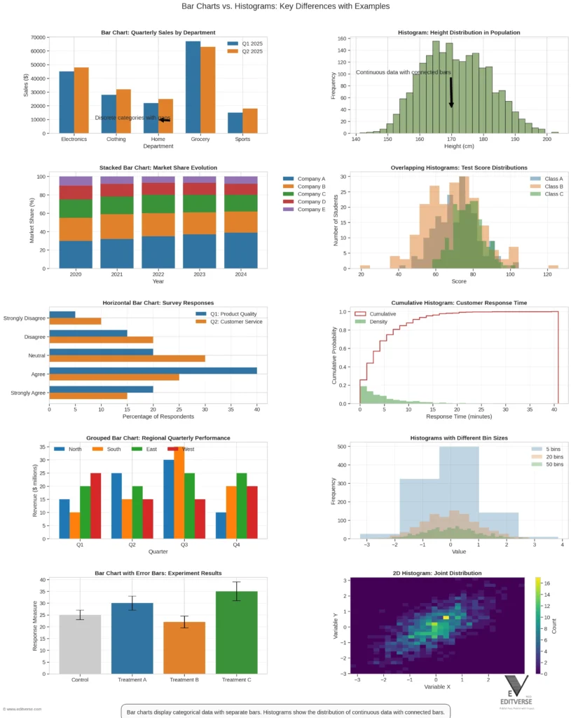
Bar charts have gaps between the bars. Histograms don’t. This is because bar charts show each data point as a separate bar. Histograms, on the other hand, group data into ranges. Knowing these differences is key when choosing the right chart for your data.
Some key differences between bar charts and histograms include:
- Bar charts compare categorical data, while histograms visualize continuous data.
- Bar charts have space between the bars, while histograms do not.
- Bar charts represent each data point as a separate bar, while histograms group data points into ranges.
Understanding these differences helps you pick the best chart for your needs. Whether it’s a bar chart or a histogram, our expertise in data visualization can guide you. We help you make informed choices and create effective visualizations for your analysis.
When to Use Bar Charts
Ever wondered when to use bar charts in data analysis? The answer is simple: they’re best for comparing different types of data. They’re great for presentations and reports. Bar charts vs histograms are used a lot in fields like biochemistry and cell biology.
So, when should you choose a bar chart? Think about these scenarios:
- Comparing categorical data: Bar charts are perfect for showing frequency counts of values for different levels of a variable.
- Displaying percentages: Bar charts can display other statistics such as percentages in addition to counts, making them versatile.
- Highlighting extreme values: Bar charts can help identify extreme values in data, assisting in error detection.
Bar charts are also good for graph comparison and chart analysis. They’re useful for tracking changes over time and showing patterns. For example, a study showed that the use of bar graphs in different fields varied a lot in 2020. This shows how important data interpretation is when using bar charts.
Here’s a quick summary of when to use bar charts:
| Scenario | Bar Chart Usage |
|---|---|
| Comparing categorical data | Ideal for showing frequency counts |
| Displaying percentages | Can display percentages in addition to counts |
| Highlighting extreme values | Helps identify extreme values in data |
When to Use Histograms
When we work with continuous data, histograms are a top choice for visualizing it. They clearly show the data’s shape, including the mean, median, and mode. This makes them perfect for spotting patterns and trends in our data.
Histograms shine when we’re looking at continuous data like temperature or salaries. They help us see how data points spread out over different ranges. This makes them a key tool for understanding data distribution.
Here are some great times to use histograms:
- Analyzing the distribution of continuous data
- Identifying patterns and trends in quantitative data
- Visualizing the frequency of data values within a single dataset
Using histograms lets us dive deep into our data. We can make smarter choices with the insights we get. As we keep exploring data visualization, remember that histograms are a crucial part of our toolkit.
In summary, histograms are a powerful tool for data visualization. They’re useful in many situations. By knowing when to use them, we can better understand our data and make informed decisions.
| Histograms | Bar Charts |
|---|---|
| Used for continuous data | Used for categorical data |
| Shows distribution of data | Compares data between categories |
Visual Representation: Bar Chart Examples
We use bar charts to show different kinds of data. This makes them very useful in data visualization. For graph comparison and chart analysis, bar charts are perfect for comparing data.
Bar charts help us understand how different categories relate to each other. There are several types of bar charts:
- Simple bar charts: used for comparing different categories of data
- Clustered bar charts: used for displaying multiple categories of data
- Stacked bar charts: used for displaying the contribution of each category to the total
These charts are great for bar charts and graph comparison. They help us see and analyze data well. By using bar charts, we can learn more about our data and make better choices.
By using chart analysis and data interpretation, we can get the most out of bar charts. Whether we use simple, clustered, or stacked bar charts, the important thing is to pick the right one for our data and audience.
Visual Representation: Histogram Examples
Histograms show how data is spread out. They help us see how different groups compare. Finding the right bin sizes is crucial to spot important trends.
In manufacturing, histograms help with product sizes. In finance, they analyze stock returns and risk. They show data points in each bin.
Basic Histogram Example
A basic histogram shows data shape. It helps us spot patterns and trends. It also points out data variability and anomalies.
Cumulative Histogram Example
A cumulative histogram shows data frequency over time. It helps find why data shapes change. It’s useful for production or scientific data.
Probability Histogram Example
A probability histogram shows data point chances. It helps see data distribution and patterns. It’s great for spotting outliers.
| Histogram Type | Description |
|---|---|
| Basic Histogram | Displays the distribution shape and spread of continuous numerical data values |
| Cumulative Histogram | Displays the cumulative frequency of the data |
| Probability Histogram | Displays the probability of each data point |
In conclusion, histograms are key in data visualization. They help us understand data distribution. By using them, we can make better decisions based on data analysis and visual representation.
How to Choose the Right Chart for Data Comparison
Choosing the right chart is key for effective data comparison. We guide researchers and academics in picking the best charts for their data. This ensures their message is clear and accurate. We’ll help you decide on the right chart, considering your data, audience, and final choice.
For quantitative analysis, bar charts and histograms are top choices. Bar charts are great for comparing different groups. Histograms show the spread of a single continuous variable. Think about your data and presentation goals when picking between them.
Here are some tips for choosing a chart for data comparison:
- Analyze your data to find the best chart type. Look at data type, distribution, and variable relationships.
- Think about your audience and presentation goals. Choose a chart that clearly conveys your message.
- Use bar charts for comparing values between groups. Histograms are best for showing a single continuous variable’s distribution.
By following these tips, you can pick the right chart for data comparison. Remember to consider your audience. Choose a chart that’s easy to understand and interpret.

Tools for Creating Bar Charts and Histograms
Data visualization is key to sharing insights. Many tools help make bar charts and histograms. Each tool has its own strengths and benefits. The right tool can make your data presentation clearer and more impactful.
Bar charts and histograms are essential for showing data trends and patterns. Bar charts are great for comparing different groups. Histograms are best for showing how continuous data is spread out.
Popular Software Options
Microsoft Excel and Google Sheets are top choices for making bar charts and histograms. They offer many features for customizing your charts. You can change colors, labels, and more.
Online Tools for Easy Chart Creation
Online tools like Venngage are great for quick, professional charts. They have a simple interface and lots of templates. You don’t need to know a lot about software to use them.
Tips for Effective Chart Design
Designing bar charts and histograms needs careful thought. Choose the right colors and make sure labels are clear. Avoid making things too complicated. This way, your charts will be both useful and interesting.
Using these tools and tips, you can make top-notch bar charts and histograms. This will improve your data visualization and communication.
| Tool | Features | Benefits |
|---|---|---|
| Microsoft Excel | Customizable charts, data analysis tools | Highly customizable, widely available |
| Google Sheets | Real-time collaboration, automatic chart updates | Convenient for team projects, accessible online |
| Vennage | User-friendly interface, wide range of templates | Easily creates professional-looking charts, no extensive software knowledge required |
Interpreting Data from Bar Charts and Histograms
We help researchers and academics understand data from bar charts and histograms. Bar charts are great for comparing data in different groups. They’re perfect for business, marketing, and finance. Histograms, however, show how continuous data spreads out, like height or weight.
It’s key to know the data type when looking at these charts. Bar charts are for categorical data, while histograms are for continuous data. This helps in accurate analysis and decision-making.
Analyzing Trends from Bar Charts
Bar charts can also show percentages. They come in vertical or horizontal styles. This makes them a strong tool for spotting errors and patterns in data.
Understanding Distribution from Histograms
Histograms help with continuous data, showing its spread. They reveal the data’s shape, including the mean and median. This info is crucial for making smart decisions based on the data.
Conclusion: Charting Your Data Insightfully
We’ve looked at the differences between bar charts and histograms, two key tools in data visualization. Knowing how to use each helps us share our message clearly. Data visualization is key to making complex data easy to understand. Choosing the right chart is crucial for clear communication.
Bar charts and histograms help us show data in different ways. Bar charts are great for comparing different groups. Histograms are better for showing how data spreads out. Picking the right chart makes sure our data is easy to get and understand.
Some important tips for good data visualization include:
- Know the basics of bar charts and histograms
- Pick the best chart for your data
- Make sure your data is clear and correct
By following these tips and trying out different charts, we can make our visualizations informative and engaging.
| Chart Type | Purpose | Characteristics |
|---|---|---|
| Bar Chart | Comparing categorical data | Rectangular bars, separate bars |
| Histogram | Representing continuous data distributions | Adjacent bars, frequency distribution |
Research & Data Analysis Services | Editverse.com
We offer top-notch research support and data analysis. Our team is here to help you publish in leading journals. We provide quality and integrity in our professional services.
Your Comprehensive Research Support Partner
At Editverse.com, we know how crucial accurate data analysis is. We offer a variety of services like data analysis and research support. Our goal is to help you share your findings and reach your publication goals.
Industry-Leading Expertise Since 2020
Our team brings expertise in research and data analysis. We keep up with the latest in academic publishing and data analysis. This ensures our clients get the best support.
- Data analysis and interpretation
- Academic publishing and manuscript preparation
- Research design and methodology
- Statistical analysis and modeling
Choosing Editverse.com means you get top-level support in data analysis and publishing.
| Service | Description |
|---|---|
| Data Analysis | Expert data analysis and interpretation |
| Academic Publishing | Manuscript preparation and publication support |
| Research Design | Methodology development and research planning |
Statistical Analysis Services
We offer detailed statistical analysis services. This includes advanced statistical modeling to help researchers make smart choices. Our team knows a lot about different statistical methods, like regression analysis and hypothesis testing.
Our services aim to uncover important insights from data. This helps researchers spot trends and connections. We use data modeling to tackle complex data sets and offer practical advice. Our services are customized for each project, ensuring top-notch results for our clients.
Here are some key benefits of our statistical analysis services:
- Advanced statistical modeling to find complex data relationships
- Data modeling to analyze and understand big data sets
- Research services to support research studies and publications
Using our statistical analysis services, researchers can better understand their data. This leads to more informed decisions. Our team is dedicated to delivering excellent research services that set the highest standards.
Data Visualization Excellence
We offer top-notch data visualization services. This includes ready-to-publish scientific graphs, custom charts, and interactive visualizations. Our team knows how crucial clear visuals are for sharing research. We aim to make our visualizations both informative and engaging.
Our services are made for researchers and academics to share their findings well. We use data visualization to craft scientific graphs and custom charts that fit each project’s needs. Whether it’s a simple bar chart or a complex interactive piece, we can deliver high-quality results.
Benefits of our data visualization services include:
- Improved communication of research findings
- Enhanced visibility and impact of research
- Increased engagement and understanding of complex data
- Customized visualizations tailored to specific needs
Our team is dedicated to outstanding results and meeting our clients’ high standards. We employ the latest tools and technologies for interactive, dynamic visualizations. With our skills in data visualization, scientific graphs, and custom charts, your research will shine.
| Type of Visualization | Description |
|---|---|
| Bar Charts | Compare different data sets |
| Histograms | Illustrate data distribution |
| Scatter Plots | Show relationships between variables |
Research Enhancement Services
We offer detailed research services to help researchers meet their goals. Our team of experts provides support in systematic reviews, meta-analyses, and research design. This ensures studies are well-planned and executed with the utmost quality and integrity.
Our services aim to simplify the study design, data collection, and analysis process. We assist with systematic review to find and combine relevant literature. Our meta-analysis expertise helps merge data from various studies for stronger conclusions.
The benefits of our services include:
- Improved study design and methodology
- Enhanced data analysis and interpretation
- Increased confidence in research findings
- Greater efficiency and productivity in the research process
By using our services, researchers can concentrate on their main tasks. We handle the technical aspects of study design, data analysis, and results interpretation. Our aim is to support researchers in publishing their work in top journals ethically and professionally.
| Service | Description |
|---|---|
| Systematic Review Support | Identification and synthesis of relevant literature |
| Meta-Analysis Expertise | Combination of data from multiple studies to draw robust conclusions |
| Research Design Consultation | Expert guidance on study design and methodology |
Specialized Analytics
At Editverse, we offer more than just basic data tools. We know that deep analysis is key for researchers and scientists. Our team is trained in advanced techniques like clinical trial data analysis and survey data processing.
Need to dive into complex clinical trial data or survey results? Our services can help. We use the latest in statistical modeling, data mining, and machine learning. This helps us find patterns, spot outliers, and give you insights that matter.
Working with Editverse means you get top-notch analytics support. We’re here to help you understand your data deeply. This way, you can focus on your research, and we’ll handle the complex analysis.
FAQ
What are the key differences between bar charts and histograms?
Bar charts show categorical data, while histograms show continuous data. This is the main difference between them.
When should I use a bar chart versus a histogram?
Use bar charts for comparing categories. Histograms are better for showing continuous data, like measurements.
What are the advantages of using bar charts?
Bar charts are simple to understand. They’re great for presentations and reports. They can show different types of data, like simple comparisons and stacked data.
What are the advantages of using histograms?
Histograms clearly show continuous data. They help understand the data’s shape, including the mean, median, and mode. They’re key in statistics and data analysis.
What are some common mistakes to avoid when using bar charts and histograms?
Don’t use bar charts for continuous data. Avoid 3D effects that can mess up the data. For histograms, pick the right bin sizes. Don’t use them for categorical data.
What tools are available for creating high-quality bar charts and histograms?
Tools like Microsoft Excel and Google Sheets have many features for charts. Online tools, like Venngage, offer easy use and lots of templates.
How can I effectively interpret data from bar charts and histograms?
Analyzing bar charts helps spot patterns and relationships. Histograms give insights into data distribution, like the mean and median.
Source Links
- https://venngage.com/blog/bar-charts-vs-histograms/ – Bar Charts Vs Histograms: A Complete Guide – Venngage
- https://www.thoughtspot.com/data-trends/data-visualization/histogram-vs-bar-graph – Histogram vs Bar Graph: Which Should You Use?
- https://www.akkio.com/post/histogram-vs-bar-graph – Comparing Histogram vs Bar Graph: Key Differences and Similarities
- https://www.syncfusion.com/blogs/post/difference-between-bar-graph-and-histogram-chart – 8 key differences between Bar graph and Histogram chart | Syncfusion
- https://www.atlassian.com/data/charts/histogram-complete-guide – Histograms Unveiled: Analyzing Numeric Distributions
- https://www.r-bloggers.com/2022/10/difference-between-a-histogram-and-a-bar-graph/ – Difference Between a Histogram and a Bar Graph | R-bloggers
- https://www.storytellingwithdata.com/blog/2021/1/28/histograms-and-bar-charts – histogram versus bar graph — storytelling with data
- https://pmc.ncbi.nlm.nih.gov/articles/PMC9366861/ – Replacing bar graphs of continuous data with more informative graphics: are we making progress?
- https://www.jmp.com/en_us/statistics-knowledge-portal/exploratory-data-analysis/bar-chart.html – Bar Chart
- https://www.luzmo.com/blog/histogram-vs-bar-chart – Histogram vs. Bar Chart – Which One to Use and When? | Luzmo
- https://clickup.com/blog/histogram-vs-bar-graph/ – Histograms vs. Bar Charts Difference: What to Use & When
- https://www.geeksforgeeks.org/bar-graphs-and-histograms/ – Bar Graphs and Histograms | Examples, Properties & Difference – GeeksforGeeks
- https://www.lucidchart.com/blog/histogram-vs-bar-graph – Histogram Vs. Bar Graph | Lucidchart
- https://www.polymersearch.com/glossary/histogram-vs-bar-graph – Histogram vs Bar Graph: Key Differences & Uses Explained
- https://medium.com/@filip.sekan/bar-chart-vs-histogram-understanding-the-differences-and-choosing-the-right-for-data-visualization-cce5ff279c61 – Bar Chart vs Histogram: Understanding the Differences and Choosing the Right for Data Visualization
- https://www.storytellingwithcharts.com/histogram-vs-bar-graph-key-differences-you-must-know/ – Histogram vs Bar Graph Key Differences You Must Know!
- https://www.toppr.com/guides/maths/statistics/bar-graphs-and-histogram/ – Bar Graphs and Histogram: Definition, Differences with Solved Examples
- https://ashwinmore.com/histogram-vs-bar-graph/ – Histogram Vs Bar Graph: The 8 Key Differences Between Both
- https://www.atlassian.com/data/charts/how-to-choose-data-visualization – How to Choose the Right Data Visualization | Atlassian
- https://www.holistics.io/blog/how-to-choose-the-right-charts-for-your-data/ – How To Choose the Right Charts for Your Data
- https://medium.com/@mokkup/data-visualization-how-to-pick-the-right-chart-type-f6f65824928a – Data Visualization — How to Pick the Right Chart Type?
- https://www.atlassian.com/data/charts/essential-chart-types-for-data-visualization – Essential Chart Types for Data Visualization | Atlassian
- https://statisticseasily.com/histogram-vs-bar-graph/ – Histograms vs Bar Graphs in Data Visualization
- https://www.linkedin.com/advice/1/what-role-histograms-visualizing-your-data-trends-26qkc – What is the role of histograms in visualizing your data trends?
- https://leanscape.io/histogram-a-comprehensive-guide/ – Histogram: A Comprehensive Guide – LeanScape
- https://editverse.com/choosing-the-right-graph-type-a-guide-for-researchers/ – Choosing the Right Graph Type for Your Data: A Comprehensive Guide for Researchers
- https://journal.ahima.org/page/using-bar-charts-to-compare-data-in-categories – Using Bar Charts to Compare Data in Categories
- https://www.lrs.org/2024/02/01/heres-a-hand-with-histograms/ – Here’s a Hand with Histograms – Library Research Service
- https://coefficient.io/data-analytics/histogram-vs-bar-graph – Histograms vs Bar Graphs: Key Differences & Use Cases
- https://revopsteam.com/revenue-intelligence/categories-of-data-visualization/ – Data Visualization Explained: Using Graphs, Charts, and Maps to Tell Stories with Data
- https://www.thoughtspot.com/data-trends/data-visualization/types-of-charts-graphs – 20 Types of Charts And Graphs For Data Visualization
- https://medium.com/@nitesh.py/choosing-the-right-statistical-charts-for-effective-data-analysis-944d8991562d – Choosing the Right Statistical Charts for Effective Data Analysis
- https://archive.cdc.gov/www_cdc_gov/csels/dsepd/ss1978/lesson4/section4.html – Lesson 4, Section 4|Self-Study Course SS1978|CDC
- https://ninjatables.com/types-of-comparison-charts/?srsltid=AfmBOoqE5p7An37G3aocuz0OO-CvjuDm15kpan3AqVNzcem1b2ylZWtL – 7 Best Comparison Charts for Effective Data Visualization
- https://falconediting.com/en/blog/crafting-effective-graphs-and-visualizations-for-research/ – No title found
- https://www.geeksforgeeks.org/charts-and-graphs-for-data-visualization/ – Charts and Graphs for Data Visualization – GeeksforGeeks
- https://fortifiedlearn.com/blog/bar-chart-vs-histogram/ – Bar Chart Vs Histogram