A recent study found that data will almost double by 20251. This shows how crucial data visualization is for researchers. It helps us share our findings, motivate teams, and impress stakeholders. Learning various graphs and charts lets us simplify complex data, build trust, and increase our impact.
10 Essential Graph Types Every Researcher Should Know in 2024
In the ever-evolving landscape of research and data analysis, effective visualization is key to communicating complex findings. As we move into 2024, researchers across all disciplines must be well-versed in a variety of graph types to present their data compellingly and accurately.
“The greatest value of a picture is when it forces us to notice what we never expected to see.” – John Tukey, American mathematician
Why Mastering These Graph Types is Crucial
- Enhances data interpretation and analysis
- Improves communication of research findings
- Increases the impact and reach of your research
- Facilitates better decision-making based on visual data
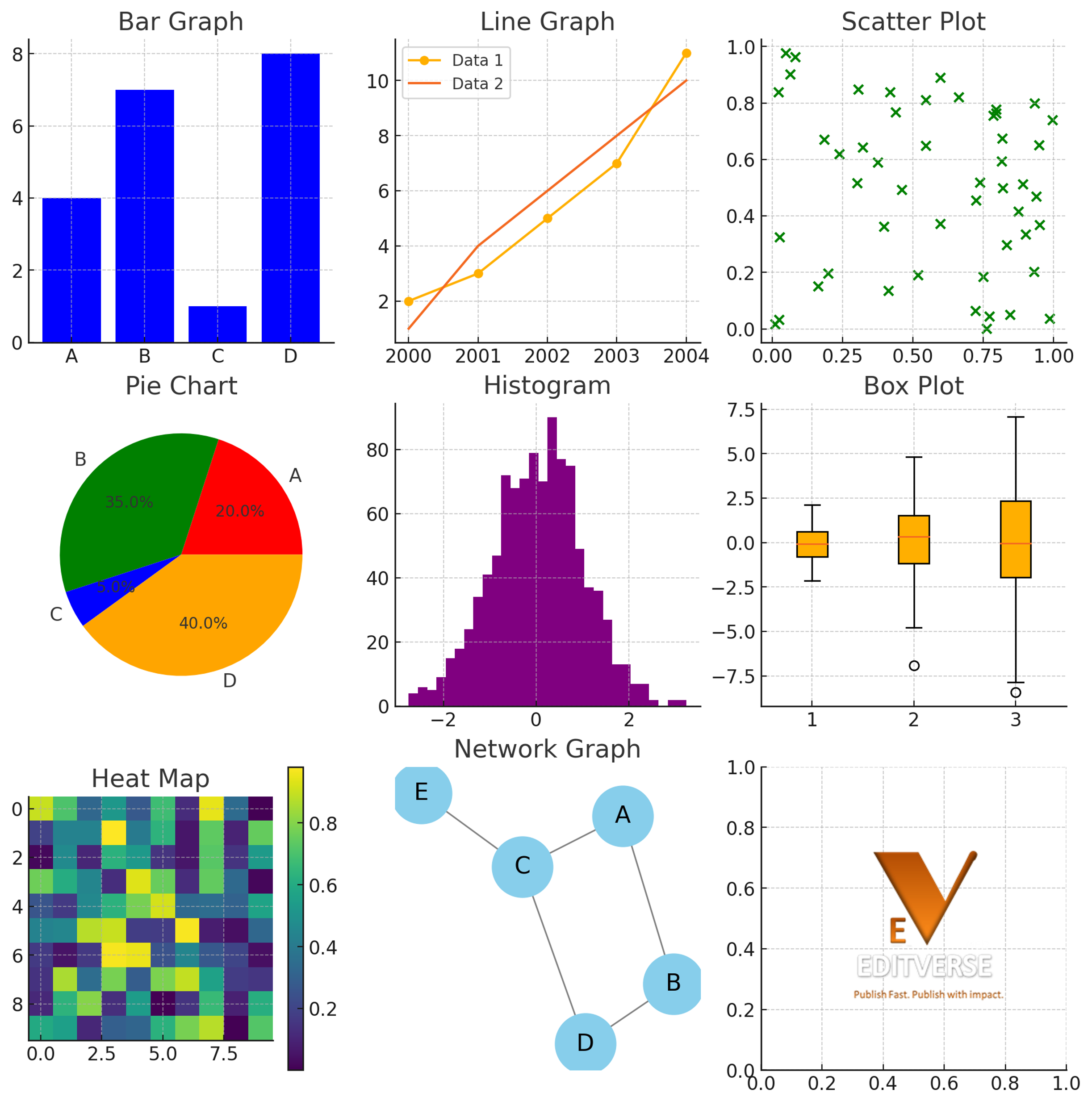
The 10 Essential Graph Types
1. Bar Graphs
What: Rectangular bars with lengths proportional to the values they represent.
Why: Excellent for comparing categories or showing changes over time.
How: Use vertical or horizontal bars; ensure the y-axis starts at zero.
Trivia: The first bar chart is credited to William Playfair in his 1786 book “The Commercial and Political Atlas”.
2. Line Graphs
What: Data points connected by straight line segments.
Why: Best for showing trends over time or continuous data.
How: Plot data points and connect them with lines; use different colors or patterns for multiple series.
Fact: Line graphs can effectively display up to 4-5 different data series before becoming cluttered.
3. Scatter Plots
What: Individual data points plotted on a coordinate system.
Why: Ideal for showing the relationship between two variables.
How: Plot each data point using x and y coordinates; look for patterns or correlations.
Data: A study found that scatter plots are used in approximately 70% of scientific publications involving bivariate data analysis.
4. Pie Charts
What: Circular graph divided into sectors, each representing a proportion of the whole.
Why: Useful for showing composition or proportional data.
How: Divide the circle into sectors based on percentage; limit to 5-7 categories for clarity.
Trivia: The term “pie chart” was first coined by Willard C. Brinton in his 1914 book “Graphic Methods for Presenting Facts”.
5. Histograms
What: Bar graph of a frequency distribution.
Why: Perfect for showing the distribution of continuous data.
How: Divide data into bins; height of bars represents frequency in each bin.
Fact: Histograms are crucial in fields like quality control and data analysis for identifying patterns and outliers.
6. Box Plots
What: Graphical representation of the five-number summary of a dataset.
Why: Excellent for showing the distribution and identifying outliers.
How: Display minimum, first quartile, median, third quartile, and maximum values.
Data: Box plots were introduced by statistician John Tukey in 1970 and have become a staple in exploratory data analysis.
7. Heat Maps
What: Data matrix where individual values are represented as colors.
Why: Useful for visualizing patterns in large datasets.
How: Assign colors to data values; use a color scale to represent intensity.
Trivia: Heat maps are widely used in fields ranging from biology (gene expression) to climate science (temperature patterns).
8. Network Graphs
What: Visualization of interconnected entities as nodes and edges.
Why: Ideal for showing relationships and connections in complex systems.
How: Represent entities as nodes and connections as edges; use size and color to convey additional information.
Fact: Network graphs are essential in fields like social network analysis, epidemiology, and systems biology.
9. Treemaps
What: Hierarchical data displayed as nested rectangles.
Why: Effective for showing hierarchical structures and proportions simultaneously.
How: Divide area into rectangles sized according to the data value; nest sub-categories within larger rectangles.
Data: Treemaps were developed by Ben Shneiderman in the 1990s to visualize hard drive usage.
10. Sankey Diagrams
What: Flow diagram where the width of the arrows is proportional to the flow quantity.
Why: Excellent for visualizing the transfer of energy, materials, or costs between processes.
How: Create nodes to represent stages or categories; connect with arrows whose widths represent flow quantities.
Trivia: Named after Captain Matthew Henry Phineas Riall Sankey, who used this type of diagram in 1898 to show energy efficiency of a steam engine.
Comparison Table: When to Use Each Graph Type
| Graph Type | Best For | Limitations |
|---|---|---|
| Bar Graphs | Comparing categories, showing change over time | Can be misleading if y-axis doesn’t start at zero |
| Line Graphs | Showing trends over time, continuous data | Can become cluttered with too many data series |
| Scatter Plots | Showing relationships between two variables | Limited to two variables (three with bubble plots) |
| Pie Charts | Showing composition or proportions | Difficult to compare slices, limited to few categories |
| Histograms | Showing distribution of continuous data | Sensitive to bin size choice |
| Box Plots | Showing distribution and outliers | Can hide underlying distribution details |
| Heat Maps | Visualizing patterns in large datasets | Color interpretation can be subjective |
| Network Graphs | Showing relationships and connections | Can become complex with large datasets |
| Treemaps | Showing hierarchical structures and proportions | Can be difficult to compare non-adjacent rectangles |
| Sankey Diagrams | Visualizing flow and transfer between processes | Can become complex with many stages or categories |
How Editverse Can Help Researchers
At Editverse, we understand the importance of effective data visualization in research. Our team of expert editors and statisticians can assist you in selecting the most appropriate graph types for your data, ensuring that your visualizations accurately represent your findings and adhere to best practices in data presentation. We offer:
- Guidance on choosing the right graph type for your specific data and research questions
- Expert review and enhancement of your data visualizations
- Assistance in formatting graphs to meet journal-specific requirements
- Statistical consultation to ensure your data is accurately represented
- Training and resources to improve your data visualization skills
By leveraging Editverse’s services, you can ensure that your research presentations are not only accurate but also visually compelling, increasing the impact and reach of your work in the scientific community.
Conclusion
Mastering these 10 essential graph types will significantly enhance your ability to communicate complex data effectively. As research becomes increasingly data-driven, the skill of choosing and creating the right visualization is more crucial than ever. Remember, the goal is not just to present data, but to tell a clear, compelling story that advances scientific understanding.
“The purpose of visualization is insight, not pictures.” – Ben Shneiderman, American computer scientist
Test Your Knowledge
Try our interactive quiz to test your understanding of when to use each graph type!
Data visualization is key for researchers in all fields. It helps us spot trends, find insights, and share our data’s story. The right graph can turn a dull presentation into one that grabs attention. This guide will cover 10 essential graph types for researchers in 2024 to boost their skills.
Key Takeaways
- Data visualization is crucial for researchers to effectively communicate findings and build trust with stakeholders.
- Mastering a diverse set of graph types can help researchers organize complex data and tell compelling stories.
- The right graph can make the difference between a forgettable presentation and one that captivates the audience.
- This guide will explore 10 essential graph types that every researcher should know in 2024 to enhance their data visualization skills.
- Understanding the best use cases and design best practices for each graph type is key to creating impactful data visualizations.
Researchers now have many tools and techniques for data visualization. From classic bar graphs and line graphs to specialized ones like bullet graphs and waterfall charts. By learning these 10 essential graph types, we can improve our data visualization skills and make a bigger impact with our research.
Introduction to Data Visualization for Researchers
We know how powerful data is in making informed decisions and finding important insights. But, how we share those insights matters a lot. That’s why data visualization is key in our work.
Importance of Data Visualization in Research
Data visualization is more than making charts and graphs look nice. It’s a smart way to turn complex data into something easy to understand. By using visuals, we grab our audience’s attention, show key patterns, and share our research clearly.2
Studies show our brains like visual info better than text. Visuals help us spot connections, find unusual points, and see insights in the data.3 This helps us in our research and lets us share our findings well with others.
Understanding Charts vs Graphs
Charts and graphs are often mixed up, but they’re different. Charts show current data in tables or diagrams, while graphs focus on how one thing affects another.3
Knowing these differences helps with good data visualization. Charts are great for static info, and graphs show trends and relationships over time.3 Picking the right tool helps us share our research clearly and strongly.
“Effective data visualization is not just about making pretty pictures – it’s about transforming complex information into a format that resonates with our audience and drives meaningful action.”
Bar Graphs
Bar graphs are great for showing changes over time and comparing different groups. They use the length of bars to show how big the data points are. These charts are perfect for marketing and sales data comparison4. They work well when there are big differences in the data or when you want to see how one group stands out from others4.
Best Use Cases for Bar Graphs
Bar graphs are useful in many situations. They’re great for showing data over time, like sales or customer engagement over quarters or years. Stacked bar graphs help break down sales by time4. They also do well in comparing data between groups, like product performance or marketing campaign success.
Design Best Practices for Bar Graphs
To make bar graphs clear, follow some design tips. Use the same colors, label the axes well, and start the y-axis at 0 for accurate data reflection. Broken-Scale Bar Graphs are for when the data varies a lot and big bars are needed5. Following these tips makes bar graphs a strong tool for comparing data and spotting trends.
In short, bar graphs are a flexible and strong way to show data insights. They’re great for tracking changes or comparing group performances. With good design and use, bar graphs can clearly share complex information. This helps in making better decisions.
Line Graphs
Line graphs are key for visualizing data trends. They help track data over time. These graphs are great for showing trends, progress, or changes in data6. They highlight trends or progress over time7.
Line graphs are great for comparing changes in more than one group over time. This is very useful for seeing how different groups relate to each other. They help spot patterns in continuous data representation6. For these charts, the data range should fill about 70 to 80 percent of the graph’s height.
It’s important to make sure the y-axis starts at zero for line graphs. This makes the data more accurate7. Using different colors or line styles helps show multiple data series clearly. By using line graphs well, researchers can share complex data trends effectively.
“Line graphs are a versatile tool for visualizing trends and changes over time, making them a must-have in every researcher’s data analysis toolkit.”
| Strengths | Limitations |
|---|---|
|
|
Bullet Graphs
Bullet graphs are a great way to see how an organization is doing towards its goals. They show how a metric is doing against a target or benchmark. This helps a lot with making decisions. Bullet graphs pack a lot of info into a small space, making them perfect for dashboards and reports8.
These graphs are easy to understand. They have a line for comparison and use colors to show how a metric is doing9. This makes it clear how a metric is doing against its goal. The colors also show where attention is needed.
Best Use Cases for Bullet Graphs
Bullet graphs are great for comparing performance against goals. They are especially useful for:
- Keeping an eye on key performance indicators (KPIs) and seeing progress towards targets
- Finding potential problems or areas that need work
- Adding context to data by showing metrics with benchmarks or thresholds
Design Best Practices for Bullet Graphs
It usually takes about a minute to learn how to read a bullet graph8. They are easy to understand. To make sure they work well, follow these design tips:
- Use different colors to show good and bad performance. For example, green for good and red for bad.
- Keep the number of bullet graphs on a dashboard low to avoid a messy look. Bullet graphs show one measure at a time. If you have many, they’re not meant to be compared directly unless they use the same scale8.
- Make sure the dashboard’s complexity fits the audience. The level of detail on a dashboard should match the audience’s understanding8.
By using these tips, you can make bullet graphs that clearly show performance against goals. They give valuable insights to your audience.
Column + Line Graphs (Dual-Axis Charts)
Column + line graphs mix a column and line graph on the same X-axis. They’re great for comparing data sets with different units, like rates and times10.
Best Use Cases for Column + Line Graphs
These charts are perfect for showing data that can’t be on the same scale. For instance, you could show sales (columns) and profit margins (line) together. This helps you see how they relate11.
They’re also useful in marketing, finance, science, and project management. In these fields, tracking several KPIs at once is key11.
Design Best Practices for Column + Line Graphs
To make a good dual-axis chart, use different colors for the columns and line. This makes the data stand out. Make sure the Y-axes are labeled clearly with their units10.
Also, adjust the Y-axis scales so both metrics are clear and their relationship is easy to see. By doing this, you can make charts that give quick insights11.
“Dual-axis charts are a powerful tool for researchers who need to compare data sets with different measurement units. By displaying the information side-by-side, these graphs make it easy to spot relationships and trends that might otherwise be obscured.”
10 Essential Graph Types Every Researcher Should Know
We often use data visualization to share our findings and make our work more impactful. Knowing the essential graph types for researchers helps us create powerful visuals that support our research. Here, we’ll look at 10 graph types every researcher should know in 2024.
- Bar Graphs: These compare measurements between different groups using vertical or horizontal bars. Bar charts can be vertical or horizontal, with vertical ones called column charts.12
- Line Graphs: Great for showing changes over time. Line graphs are perfect for displaying continuous changes.13
- Bullet Graphs: These add context and benchmarks to a single value. Bullet charts use extra markings to help understand values and benchmarks.12
- Column + Line Graphs: These charts combine two types for easy comparison. They mix two charts with a shared x-axis and different y-axes.12
- Column Charts: They compare groups using vertical bars. Bar graphs are great for comparing different groups.13
- Scatter Plots: Show how two continuous variables relate using points. Scatter Plots help us see the link between two continuous variables.13
- Histograms: Use vertical bars to show how continuous data is spread out. Histograms are for showing continuous data ranges and how many data points are in each range.12
- Heatmaps: These are grid-based and use color to show values. Heatmaps use color to show values in a grid based on two variables.12
- Pie Charts: Show how big each category is. Pie charts are specialist charts that show the size of different categories.12
- Funnel Charts: Track user flow or pipeline stages, with size showing values. Funnel charts show how users move through a process, with size showing the number of users at each stage.12
Learning these data visualization techniques for research impact helps researchers make compelling visuals. By knowing when and how to use each graph type, we can make data visualization work for us. This way, we can share our findings better and make a bigger impact with our research.
“Show Me the Numbers” by Stephen Few suggests four main ways to show numbers: bars, lines, points, and boxes12.
As research changes, keeping up with the latest essential graph types for researchers and data visualization techniques for research impact is key. These tools help us share our findings well and drive change. By using these powerful tools, we can improve our research and spread its influence in the future.
Column Charts
Column charts, also known as vertical bar charts, are great for showing differences between items or changes over time14. They use the vertical axis to show numbers, making them perfect for things like customer surveys, sales, and profit analysis15.
Best Use Cases for Column Charts
Column charts are useful in many situations, such as:
- Comparing how different groups or categories perform
- Showing changes in data over time, like sales each month
- Pointing out the size or proportion of different data points
- Creating a clear, easy-to-understand visual order
Design Best Practices for Column Charts
To make effective column charts, follow these tips:
- Use the same colors for categories or data series
- Make sure x-axis labels are horizontal and readable
- Start the y-axis at 0 for easy comparison
- Adjust column width and spacing for better balance and clarity
- Think about adding data labels or tooltips for exact numbers
By using these tips, researchers can make column charts that clearly share their data and insights. This makes them a key part of the data visualization toolkit15.
Scatter Plots
Scatter plots are a key tool for showing how two numbers relate to each other. They use points on a graph to show values for each variable. These plots are great for spotting outliers and seeing if the relationship is strong or weak16.
Graphic designers find scatter plots advanced and they’re getting more popular in media16. For example, 63% of Americans learned that eating more sugar leads to more cavities from a scatter plot16. Also, 79% of those with a college degree and 84% with a postgraduate degree understood scatter plots well16.
These plots show how variables relate, with a line that best fits the data showing the strength and direction of the relationship16. 6 in 10 adults could correctly read a scatterplot16. They’re useful for seeing patterns and trends in data17.
| Advantages of Scatter Plots | Disadvantages of Scatter Plots |
|---|---|
|
|
Scatter plots are great for seeing if two variables are related, especially in science and business17. The scatterplot shows correlation, not causality, between two variables16. Yet, most data journalists find them useful for showing lots of data points16.
In conclusion, scatter plots are a strong tool for uncovering insights in data. By knowing their strengths and limits, researchers can use them well to support their work and decisions.
Histograms
We often go through a lot of data to find important insights. The histogram is a great tool for this. It shows how a dataset is spread out18. It’s perfect for big datasets with numbers, but not for categories18.
Histograms help us see the main parts of the data, like the average and how spread out it is18. They show us patterns, trends, and odd points in the data. This helps us understand what’s going on18.
Choosing the right number of bins is key when making a histogram18. There are rules like Sturges’ rule and Freedman-Diaconis rule to help with this18. It’s also important to label the histogram well, including the units and bin sizes, for easy understanding18.
The shape of a histogram tells us a lot about the data18. A symmetrical shape often means the data follows a normal pattern. If it’s not symmetrical, it might be skewed to one side18. A histogram with two peaks might show we have two main groups in the data18.
Histograms are used in many fields, like finance and healthcare, to look at and prepare data18. By using this tool, we can find new insights and make better decisions18.
| Graph Type | Best Use Cases | Design Best Practices |
|---|---|---|
| Histograms |
|
|
“Histograms are a powerful tool for researchers, allowing us to visualize the distribution of our data and uncover valuable insights that guide our decision-making.” –
The histogram is still a key tool in data analysis. It helps us understand data patterns and make better decisions. This makes our research better.
Heatmaps
As researchers, we often need to find patterns and relationships in big datasets. Heatmaps are a great tool for this, showing us data in a grid that makes hidden insights clear19.
Heatmaps show a grid of values, with each cell colored by its value. This is super useful with big datasets, where scatter plots can get too messy19.
Heatmaps are great for spotting patterns and relationships fast. They show data in a grid, making it easy to see high and low values, and any odd points that need more looking into19.
Heatmaps are used in many areas, like weather studies and political analysis. In marketing, they’re great for looking at website traffic and sales trends19. They also help find problems on websites, making them better for users19.
| Heatmap Use Cases | Benefits |
|---|---|
|
|
Technology has made heatmaps better over time. The term “heatmap” was first trademarked in the early 1990s20. Now, AI can predict where people will look on a website with 95% accuracy in just a few seconds20.
We can use heatmaps to understand our data better, spot trends, and make smart choices. By using grid-based visualization, we can find new insights and stories in our data1920.
“Heatmaps offer a transformative approach to data analysis, allowing researchers to quickly identify key insights and make data-driven decisions that can propel their work to new heights.”
Heatmaps are useful for studying consumer behavior, environmental patterns, or political issues. By using this visualization method, we can fully explore our data and find important connections1920.
Specialized Graphs for Researchers
As researchers, we know how vital it is to share our findings clearly through data visualization. Essential graphs like line graphs, bar charts, and scatter plots are key. But, specialized graphs can take our data storytelling to the next level. These specialized graph types are great for certain research needs, making our data stories more powerful and clear.
Pie Charts
Pie charts are perfect for showing how parts relate to the whole21. They let us see the size of each category in a dataset easily. Pie charts work well when we want to show the share of different parts in a whole22.
Funnel Charts
Funnel charts are great for looking at processes like sales or conversion rates21. They show the steps in a process and the amount moving through each one. Funnel charts help us spot where things slow down, improve conversion rates, and see where people drop off in a process.
Bullet Charts
Bullet charts are great for comparing a single metric to a goal or standard22. They show how our results stack up against targets or the industry average. Bullet charts are useful for tracking performance and making data-driven choices.
Geospatial Plots
For research with geographic data, geospatial plots are a strong choice21. They put data on a map, helping us see patterns, trends, and connections by location. These plots are key in fields like city planning, disease tracking, and environmental studies, where location matters a lot.
Learning about these specialized graphs helps us share our research better. It makes our findings more engaging and supports our points with strong data visuals.
Conclusion
By learning the 10 key graph types in this article, researchers can better visualize their data. This helps us share our findings and boost the impact of our work23. These techniques are vital for gaining trust, motivating teams, and winning over stakeholders24. By choosing the right graph for the job, we can tell a strong story with our data.
When wrapping up, we should avoid mistakes like being too long-winded25, missing the big picture25, or hiding the bad news25. Instead, we should highlight the main points25, show how our research fits into the bigger picture25, and be confident in our results25. Mastering data visualization boosts our ability to share research and increase its impact.
The 10 graph types we discussed are key tools for researchers. They help us find new insights, spark innovation, and motivate action. Learning about data visualization is crucial for today’s researchers. We urge you to keep exploring and trying out these methods to improve your research and make a big difference.
FAQ
What are the 10 essential graph types that every researcher should know?
The 10 essential graph types include bar graphs, line graphs, bullet graphs, column + line graphs, column charts, scatter plots, histograms, heatmaps, as well as specialized graphs like pie charts, funnel charts, and geospatial plots.
Why is data visualization important for researchers?
Data visualization is key for researchers to share their findings clearly. It helps motivate teams and impress stakeholders. With more data, visual tools help organize it, build trust, and increase impact.
What is the difference between charts and graphs?
Charts show current data in tables and diagrams. Graphs show how one variable affects another. Knowing the difference helps researchers share their insights well.
When should researchers use bar graphs?
Use bar graphs to track changes over time or compare data between groups. They’re great for showing big changes or group comparisons.
How can line graphs help researchers communicate their findings?
Line graphs show trends or progress over time. They’re perfect for tracking a continuous data set. They help compare changes across groups and show how groups relate to each other.
What are the benefits of using bullet graphs?
Bullet graphs show progress towards goals and compare it to another measure. They provide context with a rating or performance. They’re ideal for comparing performance against goals and spotting roadblocks.
When should researchers use column + line graphs?
Use column + line graphs to compare two data sets with different units, like rates and time.
What are the key use cases for column charts?
Column charts are for comparing items or showing changes over time. They’re great for displaying negative data and have many uses, like survey data, sales, and profit analysis.
How can scatter plots help researchers identify patterns in their data?
Scatter plots show values on two variables using points on axes. They’re versatile for showing relationships, whether strong or weak. They help spot outliers and data gaps.
What is the purpose of using histograms?
Histograms show a dataset’s distribution. They graph percentages or instances of different categories. This helps see which categories are biggest and how many data points are in each.
How can heatmaps help researchers identify patterns and relationships in their data?
Heatmaps use a grid of values colored by interest variables. They’re an alternative to scatter plots for dense data, helping to see relationships clearly.
What are some specialized graph types that can enhance data communication for researchers?
Researchers should know specialized graphs like pie charts for whole-part comparisons, funnel charts for pipeline flows, bullet charts for metrics against goals, and geospatial plots for mapping data to locations.
Source Links
- https://corporatefinanceinstitute.com/resources/excel/types-of-graphs/
- https://libguides.rowan.edu/datavisualization
- https://knowablemagazine.org/content/article/mind/2019/science-data-visualization
- https://userpilot.com/blog/types-of-charts/
- https://www.geeksforgeeks.org/bar-graph-meaning-types-and-examples/
- https://piktochart.com/blog/types-of-graphs/
- https://boostlabs.com/10-types-of-data-visualization-tools/
- https://www.perceptualedge.com/blog/?p=217
- https://canworksmart.com/dashboard-design-bullet-graph-vs-bar/
- https://www.dataflake.co/data-visualization/top-10-different-types-of-data-visualization-you-should-know
- https://synodus.com/blog/big-data/data-visualization-type/
- https://www.atlassian.com/data/charts/essential-chart-types-for-data-visualization
- https://openoregon.pressbooks.pub/mhccmajorsbio/chapter/presenting-data/
- https://julius.ai/articles/types-of-charts-and-graphs
- https://www.edrawsoft.com/chart-types-uses.html
- https://www.pewresearch.org/short-reads/2015/09/16/the-art-and-science-of-the-scatterplot/
- https://visme.co/blog/scatter-plot/
- https://leanscape.io/histogram-a-comprehensive-guide/
- https://instapage.com/blog/heat-map/
- https://attentioninsight.com/heatmaps-101/
- https://www.ncbi.nlm.nih.gov/pmc/articles/PMC4078179/
- https://online.hbs.edu/blog/post/data-visualization-techniques
- https://preply.com/en/blog/how-to-describe-graphs-in-english/
- https://venngage.com/blog/how-to-choose-the-best-charts-for-your-infographic/
- https://libguides.usc.edu/writingguide/conclusion