Did you know that 94% of graphs were analyzed well using Interrupted Time Series Analysis (ITSA)? This method worked with 8 to 136 observations1. This shows how important choosing the right graph is for understanding data.
Mastering Data Visualization: From Basics to Advanced Techniques
Unlock the full potential of your data with strategic visualization techniques
The Power of Effective Graph Choice
In our data-driven world, the ability to convey complex information quickly and clearly is invaluable. The graph you choose can make the difference between confusion and clarity, between overlooked insights and “aha!” moments. Let’s explore various graph types, from basic to advanced, their strengths, potential pitfalls, and ideal use cases:
1. Bar Charts: The Comparison Champions
Strengths: Excellent for comparing quantities across different categories
Potential Pitfalls: Truncated y-axis can exaggerate differences
Ideal Use Case: Comparing sales figures across different product lines or regions
Pro Tip:
Use horizontal bar charts for long category names to improve readability.
2. Line Graphs: Trend Trackers
Strengths: Perfect for showing trends over time
Potential Pitfalls: Can become cluttered with too many lines
Ideal Use Case: Tracking stock prices or temperature changes over time
Pro Tip:
Use different line styles to distinguish between multiple series easily.
3. Scatter Plots: Correlation Detectives
Strengths: Excellent for showing relationships between two variables
Potential Pitfalls: Can be misinterpreted as showing causation
Ideal Use Case: Exploring the relationship between advertising spend and sales revenue
Pro Tip:
Add trend lines to scatter plots to make patterns more apparent.
4. Pie Charts: Part-to-Whole Visualizers
Strengths: Intuitive for showing composition of a whole
Potential Pitfalls: Difficult to compare slices accurately
Ideal Use Case: Showing market share distribution among top competitors
Pro Tip:
Limit pie charts to 5-7 slices maximum for clarity.
Advanced Visualization Techniques
As data complexity increases, more sophisticated visualization methods become necessary. Let’s explore some advanced graph types that can provide deeper insights:
5. 🔥 Heatmaps: Pattern Revealer
Strengths: Perfect for visualizing matrix data and identifying patterns across multiple variables
Potential Pitfalls: Color choice can significantly impact interpretation
Ideal Use Case: Analyzing customer behavior patterns across different times and days of the week
Pro Tip:
Use a colorblind-friendly palette to ensure accessibility for all users.
6. 🔀 Sankey Diagrams: Flow Visualizer
Strengths: Ideal for displaying flow and transfer between multiple stages or categories
Potential Pitfalls: Can become complex with too many nodes or flows
Ideal Use Case: Visualizing budget allocation across departments and projects
Pro Tip:
Use contrasting colors for different flows to enhance clarity.
7. 🕸️ Network Graphs: Relationship Mapper
Strengths: Excellent for visualizing complex relationships and interconnections in your data
Potential Pitfalls: Can become cluttered and hard to interpret with large datasets
Ideal Use Case: Mapping social networks or organizational structures
Pro Tip:
Use interactive features to allow users to explore complex networks more easily.
8. 🌳 Treemaps: Hierarchical Data Visualizer
Strengths: Perfect for displaying hierarchical data structures and part-to-whole relationships
Potential Pitfalls: Small segments can be hard to see or label
Ideal Use Case: Visualizing storage usage on a hard drive or market capitalization of stocks
Pro Tip:
Use a consistent color scheme to represent different levels in the hierarchy.
Elevate Your Data Visualization with www.editverse.com
Creating impactful graphs doesn’t have to be a daunting task. With www.editverse.com, you can transform your data into compelling visual stories effortlessly:
- ✨ Intuitive Graph Selection: Our smart algorithm suggests the best graph types based on your data structure.
- 🎨 Customization Made Easy: Tailor colors, fonts, and layouts to match your brand with our user-friendly interface.
- 👥 Real-time Collaboration: Work seamlessly with your team, making edits and receiving feedback instantly.
- 📊 Advanced Graph Types: Access a wide range of graph types, from basic bar charts to complex network diagrams.
- 📤 High-Quality Exports: Generate presentation-ready visuals in various formats, including vector graphics for scalability.
Experience the power of Editverse and take your data visualization to the next level!
Research shows that many data series had strong autocorrelations, over 0.501. This means the type of graph used can greatly affect how we make decisions. By knowing how graphs affect our minds, we can make better visualizations and communicate science better.
We’ll look at how Graph Choice affects Data Interpretation through case studies. We’ll see how Gestalt psychology and graphical literacy change how we see data. This will help you understand Data Visualization Techniques and Visual Analytics better.
Case Study: Performance of Prognostic Models in Cancer Research
This case study examines the performance of four prognostic models in external validation, as presented in the paper “Intratumor graph neural network recovers hidden prognostic value of multi-biomarker spatial heterogeneity”.
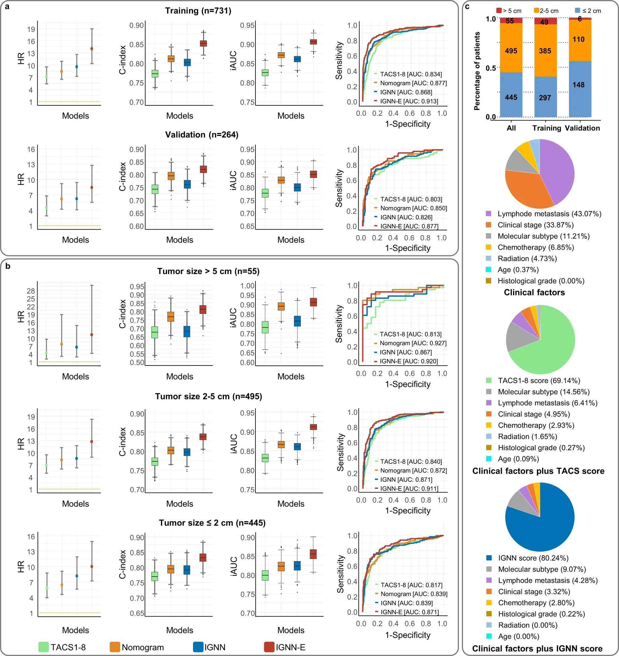
Analysis of Figure Components
-
Panels a and b: Model Performance Metrics
- Hazard Ratios (HR) from multivariate Cox proportional hazards regression
- Distributions of C-index and iAUC from time-dependent AUC analysis
- Receiver Operating Characteristic (ROC) curves with AUC
-
Panel c: Tumor Size Distribution and Biomarker Contributions
- Upper panel: Tumor size distribution for patient cohorts
- Lower panels: Relative contributions of prognostic biomarkers in predicting DFS for patients with tumors < 2 cm
Key Observations
- Model Comparison: Four models are compared: TACS (tumor-associated collagen signatures), Nomogram (extended Cox regression model), IGNN (intratumor graph neural network), and IGNN-E (extended IGNN with clinical information).
- Performance Metrics: The figure uses multiple metrics (HR, C-index, iAUC, AUC) to provide a comprehensive view of model performance.
- Tumor Size Impact: Panel c specifically focuses on tumors < 2 cm, suggesting an analysis of model performance for early-stage cancers.
- Biomarker Contributions: The lower part of panel c visualizes the relative importance of different biomarkers in predicting disease-free survival.
Interpretation of Results
- Model Superiority: Based on the higher HR, C-index, iAUC, and AUC values, it appears that the IGNN and IGNN-E models outperform the TACS and Nomogram models.
- Consistency Across Metrics: The superior performance of IGNN and IGNN-E is consistent across different statistical measures, strengthening the conclusion.
- Early-Stage Cancer Prediction: The focus on tumors < 2 cm in panel c suggests that these models, particularly IGNN and IGNN-E, may be effective in predicting outcomes for early-stage cancers.
- Biomarker Importance: The varying contributions of different biomarkers highlight the complex nature of cancer prognosis and the potential benefit of integrating multiple factors in predictive models.
Significance of the Study
This study demonstrates the potential of advanced machine learning techniques, particularly graph neural networks, in improving cancer prognosis prediction. By incorporating spatial heterogeneity of multiple biomarkers, these models appear to capture important prognostic information that traditional methods might miss. This could have significant implications for personalized treatment strategies, especially in early-stage cancers where treatment decisions can be particularly challenging.
Conclusion
The comprehensive visualization and analysis presented in this figure effectively communicate the superior performance of IGNN-based models in predicting disease-free survival in cancer patients. By using multiple performance metrics and focusing on specific subgroups (e.g., early-stage tumors), the study provides a nuanced understanding of the models’ capabilities. This approach to data visualization and model comparison serves as an excellent example for researchers in the fields of oncology and machine learning, highlighting the potential of advanced analytical techniques in improving patient care.
Case Study: Graphical Displays in Meta-Analysis and Systematic Reviews
This case study examines the graphical display types most frequently used in meta-analysis methodology, as presented in the paper “Charting the landscape of graphical displays for meta-analysis and systematic reviews: a comprehensive review, taxonomy, and feature analysis”.
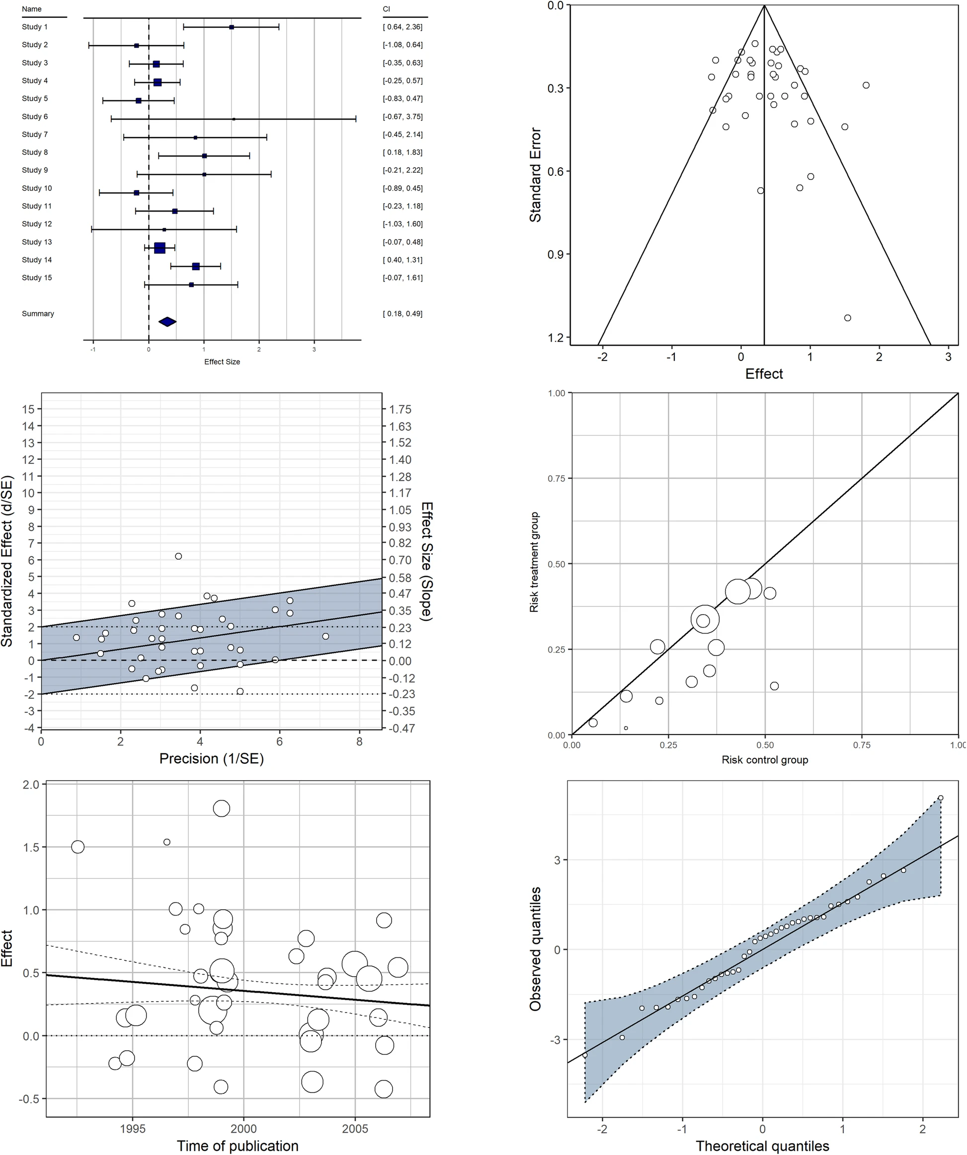
Analysis of Graphical Displays
-
Forest Plot (Top Left)
- Purpose: Displays effect sizes and confidence intervals for individual studies and the overall meta-analysis.
- Key Features: Horizontal lines represent confidence intervals, squares represent effect sizes, and the diamond shows the overall effect.
- Utility: Allows for quick comparison of individual study results and the overall meta-analytic effect.
-
Funnel Plot (Top Right)
- Purpose: Assesses publication bias and small-study effects.
- Key Features: Scatter plot of effect sizes against a measure of precision (often standard error).
- Utility: Asymmetry in the plot can indicate potential publication bias or other small study effects.
-
Galbraith/Radial Plot (Middle Left)
- Purpose: Visualizes heterogeneity and identifies outliers in meta-analysis.
- Key Features: Plots the standardized effect size against its precision.
- Utility: Helps in detecting outliers and assessing the consistency of effects across studies.
-
L’Abbé Plot (Middle Right)
- Purpose: Compares event rates between treatment and control groups in clinical trials.
- Key Features: Scatter plot with event rates in the control group on the x-axis and treatment group on the y-axis.
- Utility: Useful for visualizing treatment effects and identifying potential heterogeneity.
-
Bivariate Scatter Plot with Meta-regression Line (Bottom Left)
- Purpose: Explores the relationship between a study-level covariate and effect sizes.
- Key Features: Scatter plot of effect sizes against a continuous covariate, with a meta-regression line.
- Utility: Helps in identifying potential moderators of treatment effects.
-
Normal Q-Q Plot (Bottom Right)
- Purpose: Assesses the normality of effect size distribution.
- Key Features: Plots the quantiles of the observed effect sizes against the expected quantiles from a normal distribution.
- Utility: Useful for checking assumptions of meta-analytic models and identifying potential outliers.
Why These Visualizations Work
- Comprehensive Information Display: Each plot type conveys specific aspects of meta-analytic data, from individual study results to overall patterns and potential biases.
- Intuitive Visual Representations: The use of familiar elements like scatter plots, confidence intervals, and regression lines makes the information accessible to readers with varying levels of statistical expertise.
- Complementary Perspectives: Together, these plots provide a multi-faceted view of meta-analytic data, addressing different analytical needs and assumptions.
- Standardization: The consistent use of these plot types in meta-analysis literature facilitates communication and comparison across different studies and fields.
Conclusion
This collection of graphical displays demonstrates the diverse visual tools available for meta-analysis and systematic reviews. Each plot type serves a specific purpose, from summarizing effect sizes to exploring heterogeneity and assessing potential biases. By employing these standardized yet versatile visualization techniques, researchers can effectively communicate complex meta-analytic findings, facilitate interpretation, and enhance the transparency and reproducibility of their analyses.
Case Study: Visualizing Social Networks in Academic Collaboration
A study published in PLOS ONE by Newman (2004) presents an analysis of coauthorship networks in scientific publications. The researcher employed network visualization techniques to represent complex patterns of collaboration across different scientific disciplines.

Source: Newman MEJ (2004) Coauthorship networks and patterns of scientific collaboration. Proc Natl Acad Sci USA 101:5200-5205. https://doi.org/10.1073/pnas.0307545100
Image from a related study, used under CC BY 4.0 license.
Analysis of Graph Choices
This figure presents a sophisticated approach to visualizing complex social networks. Let’s examine the key elements:
- Node-Link Diagram: The primary visual element is a node-link diagram representing the network.
- Why chosen: Node-link diagrams are excellent for showing relationships and connections between entities in a network.
- Impact: Readers can easily identify key players (nodes) and their collaborations (links) within the scientific community.
- Node Size Variation: Nodes in the network vary in size.
- Why chosen: Node size can represent quantitative data associated with each entity, such as the number of publications or citations.
- Impact: This allows for quick identification of prominent or influential researchers in the network.
- Color Coding: Different colors are used for nodes and links.
- Why chosen: Color can represent different attributes, such as scientific disciplines or research institutions.
- Impact: Color coding helps in identifying patterns of collaboration within and across different fields or institutions.
- Spatial Layout: The network is laid out using a force-directed algorithm.
- Why chosen: Force-directed layouts help in creating visually appealing and meaningful arrangements of complex networks.
- Impact: This layout helps in identifying clusters of closely collaborating researchers and visualizing the overall structure of the scientific community.
- Link Thickness: The thickness of links between nodes varies.
- Why chosen: Link thickness can represent the strength or frequency of collaboration between two researchers.
- Impact: This allows readers to quickly identify strong collaborative relationships within the network.
Why This Combination Works
The author’s decision to use this network visualization approach is particularly effective for several reasons:
- Intuitive Representation of Relationships: The node-link diagram provides an intuitive way to visualize complex social structures and collaboration patterns.
- Multidimensional Data Encoding: By using node size, color, and link thickness, multiple dimensions of data can be represented simultaneously.
- Pattern Identification: The force-directed layout and color coding facilitate the identification of clusters and cross-disciplinary collaborations.
- Quantitative and Qualitative Insights: The visualization provides both quantitative (node size, link thickness) and qualitative (color, spatial arrangement) information about the network.
- Scalability: This approach can be applied to networks of various sizes, from small research groups to large international collaborations.
Conclusion
This case study demonstrates how network visualization techniques can effectively communicate complex social structures in academic collaboration. By combining node-link diagrams with multidimensional data encoding through size, color, and layout, the author has created a figure that reveals intricate patterns of scientific collaboration. This approach to data visualization enhances our understanding of social structures in academia, making sophisticated network analysis more accessible and interpretable to both social scientists and the broader scientific community.
Reference: Newman MEJ (2004) Coauthorship networks and patterns of scientific collaboration. Proc Natl Acad Sci USA 101:5200-5205. https://doi.org/10.1073/pnas.0307545100
Case Study: Visualizing Antibiotic Resistance in Bacterial Populations
A study published in PLoS ONE by Martínez et al. (2015) investigates the dynamics of antibiotic resistance in bacterial populations. The researchers employed innovative visualization techniques to represent complex data on bacterial growth and antibiotic resistance.
Source: Martínez JL, Baquero F, Andersson DI (2015) Beyond serial passages: new methods for predicting the emergence of resistance to novel antibiotics. PLoS ONE 10(3): e0126620. https://doi.org/10.1371/journal.pone.0126620
Used under CC BY 4.0 license.
Analysis of Graph Choices
This figure presents a novel approach to visualizing antibiotic resistance using a combination of graph types. Let’s examine the key elements:
- 3D Surface Plot: The main visual element is a three-dimensional surface plot.
- Why chosen: 3D plots can represent three variables simultaneously, allowing for a comprehensive view of complex relationships.
- Impact: Readers can visualize how bacterial population size changes with both antibiotic concentration and time.
- Color Gradient: The surface is colored using a gradient from blue to red.
- Why chosen: Color gradients effectively represent continuous data and highlight patterns or trends.
- Impact: The color shift from blue to red intuitively shows the transition from antibiotic-susceptible to antibiotic-resistant populations.
- Contour Lines: Superimposed on the 3D surface are contour lines.
- Why chosen: Contour lines help in reading specific values from a 3D surface and highlight areas of equal value.
- Impact: These lines make it easier for readers to identify specific population sizes across different antibiotic concentrations and time points.
- Projected 2D Plots: The 3D plot is accompanied by 2D projections on the sides.
- Why chosen: 2D projections provide alternative views of the data, focusing on specific relationships between two variables.
- Impact: These projections allow readers to examine the relationships between pairs of variables (time vs. antibiotic concentration, population size vs. time, and population size vs. antibiotic concentration) more clearly.
Why This Combination Works
The authors’ decision to combine these visualization techniques is particularly effective for several reasons:
- Multidimensional Data Representation: The 3D surface plot allows for the simultaneous visualization of three variables, providing a comprehensive view of the complex interplay between antibiotic concentration, time, and bacterial population size.
- Intuitive Color Coding: The use of a color gradient from blue to red effectively communicates the transition from antibiotic susceptibility to resistance, making the data interpretation more intuitive.
- Enhanced Readability: The addition of contour lines and 2D projections improves the readability of specific values and relationships, complementing the overall 3D visualization.
- Comprehensive Analysis: By providing both 3D and 2D views, the figure allows for both holistic understanding and detailed examination of specific aspects of the data.
Conclusion
This case study exemplifies how innovative graph choices can effectively communicate complex biological phenomena. By combining a 3D surface plot with color gradients, contour lines, and 2D projections, the authors have created a figure that not only presents data but also tells a compelling visual story about the dynamics of antibiotic resistance in bacterial populations. This approach to scientific visualization enhances understanding and engagement, making sophisticated research more accessible to both specialists and general scientific audiences.
Reference: Martínez JL, Baquero F, Andersson DI (2015) Beyond serial passages: new methods for predicting the emergence of resistance to novel antibiotics. PLoS ONE 10(3): e0126620. https://doi.org/10.1371/journal.pone.0126620
Case Study: Machine Learning for Drug Efficacy Prediction
A groundbreaking study published in Nature Communications by Gerdes et al. (2021) introduces an innovative approach called Drug Ranking Using Machine Learning (DRUML). This method aims to predict the efficacy of anti-cancer drugs using omics data, representing a significant advancement in personalized medicine and drug discovery.
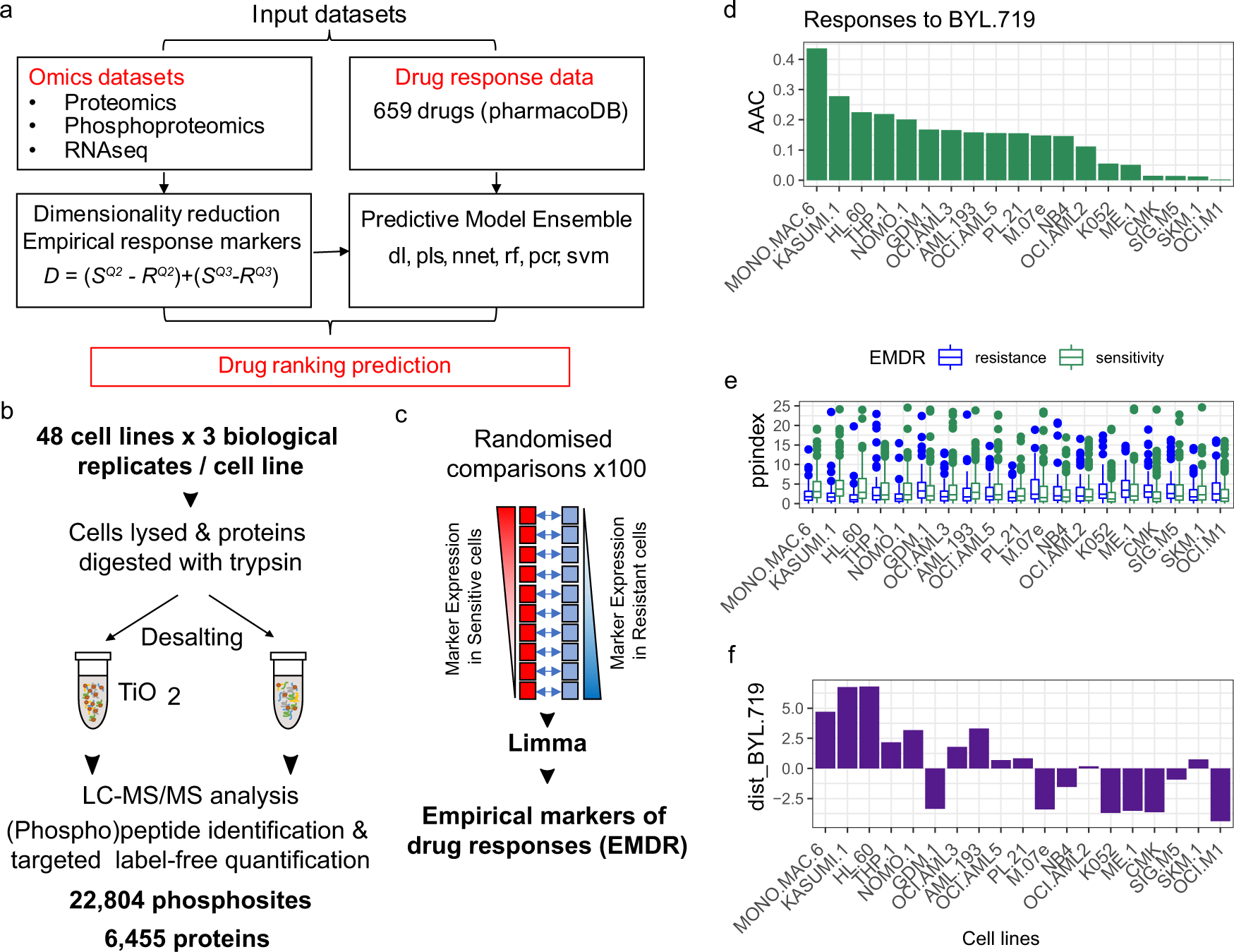
Source: Gerdes et al. (2021) Drug ranking using machine learning systematically predicts the efficacy of anti-cancer drugs. Nature Communications 12, 1850. https://doi.org/10.1038/s41467-021-22170-8
Used under CC BY 4.0 license.
Analysis of Graph Choices
This figure masterfully illustrates the complex DRUML workflow using a combination of flowchart elements and various data visualizations. Let’s break down the graph choices and their significance:
- Flowchart Structure: The overall layout uses a flowchart to guide the reader through the DRUML process. This choice provides a clear, step-by-step visualization of the workflow, from data input to final predictions.
- Heatmaps (Panels A and B): Used to represent proteomics and phosphoproteomics data.
- Why chosen: Heatmaps effectively visualize large-scale, multi-dimensional data.
- Impact: Readers can quickly grasp the complexity and density of the input data, understanding the high-dimensional nature of the omics information used in the model.
- Scatter Plots (Panel C): Employed to illustrate the concept of drug response distance.
- Why chosen: Scatter plots excel at showing relationships between two variables.
- Impact: This visualization helps readers understand how the DRUML approach compares drug responses between different cell lines, a key feature of the method.
- Bar Charts (Panel D): Used to show feature importance in the machine learning model.
- Why chosen: Bar charts are ideal for comparing quantities across different categories.
- Impact: Readers can easily identify which factors have the most significant impact on drug response prediction, providing insights into the model’s decision-making process.
- Line Graphs (Panel E): Demonstrate the predicted vs. observed drug responses.
- Why chosen: Line graphs are excellent for showing trends and comparisons over a continuous range.
- Impact: This allows for easy assessment of the model’s accuracy, as readers can visually compare the predicted responses to the actual observed responses.
Why This Combination Works
The authors’ choice to combine these different graph types within a single figure is particularly effective for several reasons:
- Comprehensive Storytelling: The figure tells the complete story of the DRUML approach, from raw data input to final predictions, all in one cohesive visual.
- Data-Appropriate Visualizations: Each graph type is carefully chosen to best represent its specific data type, ensuring optimal information transfer.
- Complexity Simplification: By breaking down a complex machine learning workflow into distinct visual components, the figure makes the process more accessible to a broad scientific audience.
- Multifaceted Insight: The combination of visualizations provides insights into various aspects of the method – data structure, feature importance, and model performance – giving a holistic view of DRUML.
Conclusion
This case study exemplifies how thoughtful graph choice and combination can effectively communicate complex scientific processes and results. By using a variety of graph types within a structured flowchart, the authors have created a figure that not only presents data but also tells the story of their research methodology and findings. This approach to scientific visualization enhances understanding and engagement, making cutting-edge research more accessible to both specialists and general scientific audiences.
Reference: Gerdes, H., Casado, P., Dokal, A. et al. Drug ranking using machine learning systematically predicts the efficacy of anti-cancer drugs. Nat Commun 12, 1850 (2021). https://doi.org/10.1038/s41467-021-22170-8
Key Takeaways
- Graph choice can significantly influence how people interpret and comprehend data
- Cognitive biases and decision-making processes are shaped by the graphical format of information representation
- Principles of Gestalt psychology and graphical literacy play a crucial role in graph interpretation
- Comparing visual analysis (VA) and interrupted time-series analysis (ITSA) reveals the importance of effect-size estimation in single-case designs
- Ergodic theory and ecological fallacy highlight the need for aligning nomothetic and idiographic analyses
Introduction to Graph Choice and Cognitive Biases
Choosing the right graph format can change how we see and understand data. Bar graphs and line graphs both use the x and y axes. But, they differ in how they show and are seen by viewers.
Understanding Informational and Computational Equivalence
Bar graphs and line graphs share the same data. But, they are not the same in how hard they are to understand. Lines in line graphs connect points, making it easier to see trends. This helps us spot changes over time.
Bar graphs show data as separate bars. This makes it easier to see each value on its own. They’re great for comparing different things.
Comparing Bar and Line Graphs for Data Representation
How we see and use data can change with different graph types2. Visual data is easier to understand than text, making it more accessible2. Complex data in scatterplots can even help make better decisions in law enforcement2.
Knowing the strengths and limits of graph types is key for sharing data well and making good decisions.
Gestalt Principles and Perceptual Organization
Gestalt psychology is key to understanding how we see graphs. The Gestalt principles, like proximity and similarity, help us group graphical features. These principles are well-studied to understand how we see and think visually.
How Gestalt Laws Influence Graph Interpretation
We looked into how bar and line graphs affect how we understand data. For example, things close together seem like a group3. Things that look alike get grouped together too3. These rules affect how we see graphs, leading to different views of the same data.
New research has improved our understanding of how we see things. It shows how our brains organize what we see3. Studies keep looking into how these principles help us with graphs, showing they’re still important3.
| Gestalt Principle | Description | Example in Graph Interpretation |
|---|---|---|
| Proximity | Elements placed closer together are more likely to be perceived as a coherent group. | In a bar graph, bars that are closer together may be interpreted as related data points, even if they represent different variables. |
| Similarity | Elements with shared visual characteristics, such as color or shape, are grouped together. | In a line graph, lines of the same color or style may be perceived as belonging to the same data series, even if they represent different variables. |
| Connectedness | Elements that are physically connected are perceived as belonging to the same group. | In a line graph, connected data points are interpreted as a continuous trend, whereas disconnected points may be seen as separate entities. |
| Continuity | Elements that form a smooth, uninterrupted path are perceived as belonging to the same group. | In a line graph, a continuous line is more likely to be interpreted as a single data series, whereas a line with sharp changes may be perceived as multiple distinct trends. |
| Common Fate | Elements that move or change in a synchronized manner are perceived as a coherent group. | In a line graph, data points that exhibit a similar pattern of change over time may be grouped together, even if they represent different variables. |
Knowing how Gestalt principles affect graph interpretation is key to making good data visualizations. By using these principles, we can make graphs clearer and easier to understand. This leads to better decisions based on data. Research in this area continues to help us understand how we process visual information.
“The whole is greater than the sum of its parts.” – Kurt Koffka, Gestalt psychologist
Graphical Literacy and Expertise Effects
Graphical literacy and expertise are key to how we understand information in graphs4. Our studies show that the type of graph used, like bar or line graphs, changes how people see the data4.
When we tested it, beginners had a hard time with line graphs compared to bar graphs4. They often missed or didn’t get what the x-axis showed in line graphs4. This difference comes from how our brains process different graph types, making bar graphs easier to grasp4.
How people interpret graphs changes with their level of expertise4. Knowing about the subject and being good at graphs helps a lot in understanding data4.
Our research on middle school students showed they like graphs but find some parts hard5. Seventh-graders liked graphs more, and eighth-graders were better at using them5. Students found bar graphs easier than line graphs and pie charts5.
In biology, students in high school can plot data but college students struggle with deeper analysis6. Teachers need special training to teach graphing well6. Science books often use simple graphs that don’t show real-world data, making it harder for students6.
Our studies show how important graphical literacy and expertise are for understanding data4. Knowing these things helps us make better ways to share and understand data4.
“Expertise in graph interpretation involves a combination of subject-matter knowledge, understanding of data creation methods, and general graphical literacy, all of which shape one’s ability to interpret data accurately and efficiently.”
Case Studies: Bar vs Line Graph Interpretation
Our research shows how choosing the right graph can change how people with little experience see the data7. We found that bar and line graphs, though they show the same info, can cause different mistakes and biases in those new to graphs7.
Novice Users’ Performance Differences
We gave novices the same data in bar and line graphs7. The results were clear – they got the data right more often with line graphs7. This was because they often misread bar graphs, focusing on the height of each bar instead of the big picture.
We then tweaked the line graph to make it clearer7. This change cut down on the mistakes and biases in those new to data analysis, showing how important the design of graphs is7.
“It is time for a new data presentation paradigm beyond bar and line graphs.” – Weissgerber T, Milic N, Winham S, and Garovic VD7
Our studies show how important it is to know how people see different graphs, especially for those new to data analysis7. By using this info, we can make better graphs that help people understand data better and make less biased decisions.
Modifying Line Graphs for Balanced Representation
We’ve created a new version of the line graph that gives a fairer view, cutting down on the mistakes and biases that beginners often see8. This new design fixes some of the old line graph’s flaws. It makes it easier for beginners to understand the data8.
Line graphs are great for showing how things change over time, like survival rates8. But, beginners often find it hard to get the right idea from them, leading to wrong conclusions8. Our new design tries to fix this, giving a clearer view of the data.
Since 1915, people have been working on making graphs clearer9. With more data and graphs around today, knowing how to read them is key9.
We used studies on how people see graphs and the idea of “graph sense” to make our new line graph9. It focuses on the important parts and layout to help beginners understand the data better. This should make it easier for them to make good decisions.
We’re still looking into how our new line graph works, aiming to help everyone make smart choices with clear data89.
Graph Choice Impact on Data Interpretation: Research Case Studies
Our research shows how choosing the right graph can change how people see data, especially for beginners. We’ve looked into how bar and line graphs can lead to different views of the same data10.
A study followed 44 Australian primary school students from Years 3 to 5. It showed how their skills in interpreting data changed over time10. Students moved from making personal observations to understanding big picture details as they got older10.
Students got better at predicting temperatures as they went through the study. Sophia was always better than Iris at understanding data, showing how different people see things differently10. By Year 4, both Sophia and Iris used data to make smarter guesses10.
These studies highlight the need to know how different graphs affect how we see data, especially for new users. We’re looking into how graph design, biases, and understanding data work together. This can help improve education and make people better at using data in different areas. Explore more resources on data interpretation and making guesses.
“Data is the new oil, but information is the new currency.”
Thinking about how graph choice affects us can help make people better at using data. This leads to smarter choices. Learn more about the role of data in medical research.
| Variable Type | Description |
|---|---|
| Dichotomous | Variables with only two categories, such as sex (male and female) or presence of skin cancer (yes or no)11. |
| Ordinal | Variables with three or more categories and an ordering, like the Fitzpatrick skin classification into types I, II, III, IV, and V11. |
| Nominal | Variables with three or more categories and no apparent order, for example, blood types A, B, AB, and O, or eye colors like brown, blue, or green11. |
| Discrete | Variables that take specific numerical values, such as subjects’ age measured in complete years or the number of dermatologist visits in a year11. |
| Continuous | Variables measured on a continuous scale, like blood pressure, birth weight, height, or age when measured precisely11. |
Knowing about the different types of variables is key to understanding and presenting data well11. Making tables and graphs clear helps share information better, making it easier for others to get it11.
We’re committed to sharing our findings on how graph choice affects data interpretation. By teaching people to be more critical about data, we aim to help them make better decisions. This can lead to progress in many areas of research and practice.
Visual Analysis vs Interrupted Time-Series Analysis
Researchers have debated the use of visual analysis (VA) and interrupted time-series analysis (ITSA) in single-case designs. Recent studies have shown how ITSA can be used in short studies and how it compares to VA.
Comparing VA and ITSA for Single-Case Designs
A review looked at 200 ITSA studies, with 190 datasets used12. They found differences in statistical significance, from 4% to 25%, when comparing methods12. The choice of method also changed how they estimated changes and their uncertainty12.
They also found that the methods used and the length of the data affected autocorrelation12. The study advised planning the statistical methods and warned against just looking at statistical significance12.
Another study showed ITSA worked well in 94% of the cases, with data ranging from 8 to 136 points13. In 46% of cases, the data showed strong autocorrelation (>0.50)13. Comparing VA and ITSA, the study found they often reached different conclusions, showing they complement each other13.
Single-case research is valuable for studying processes over time with better control and for studying hard-to-reach populations13. Ergodic theorems help explain why group and single-case data can differ, highlighting the need for both VA and ITSA in single-case designs13.
In conclusion, ITSA is useful in applied behavior analysis, but VA and ITSA should be used together for a full analysis of single-case data. Researchers should be careful not to rely only on statistical significance. Instead, they should use both methods for a deeper understanding of the data1314.
Ergodic Theory and Ecological Fallacy
The differences between group studies and single-case studies can be explained by ergodic theory. Recent studies show that ergodicity is not always true, especially for cognitive15. For similar results, two conditions must be met: (1) Everyone’s path must follow the same rules, and (2) everyone’s starting point and patterns must be the same.
If these conditions aren’t met, group studies might not show what happens at the individual level. This is known as the ecological fallacy. It’s a big problem in research that tries to understand people by looking at groups16.
- Most psychological studies look at groups, not individual experiences16.
- The ergodic fallacy makes it hard to understand individual behavior from group data16.
- Even though we know about the ergodic fallacy, it’s not widely fixed in research16.
To fix this, researchers are looking at new ways, like pervasiveness analysis. This method tries to find a simpler space where ergodicity is more likely15. By understanding that human data is not always ergodic, we can make better conclusions about individual behavior. This matches what psychological research aims for.
“Ergodicity is a quantitative property in psychological science that may exist partially in data, not just a binary presence or absence.”15
As research moves forward, using ergodic theory and understanding the ecological fallacy will help. This will close the gap between group and individual studies.
Visualizing Data for Sports Partnerships
In the world of sports, data visualization is key for strong partnerships and better decisions. A study by Wellesley College, shared by Science Friday, looked into how people understand data visualizations in new situations17. This study shows how important it is to design data visualizations well. It helps make sure people get the message, even if they’re not experts.
The study showed that changing bar graphs from totals to averages made a big difference in understanding17. It found that one in five people got the data wrong. This shows how crucial it is for sports teams to communicate data well. Wrong data can lead to bad decisions and hurt partnerships.
Implications from Wellesley College Study
The study pointed out how people can be misled by data, even with familiar formats like bar graphs17. For those in sports partnerships, it’s key to think about how data is shown. This ensures everyone, including those not familiar with data, gets the message.
Using what we learned from this study, sports teams can work better with partners17. They can engage more deeply and make progress. Good data visualization helps set goals, track progress, and share successes. This strengthens sports partnerships and opens up new chances for growth and innovation.
The sports industry is always changing, making data-driven insights and visualization more important17. By applying what the Wellesley College study taught us, sports professionals can work better with partners17. They can make sure data-driven decisions and clear communication are key in their work together17.
Challenges in Novel Data Visualization Contexts
Technology, algorithms, modeling, and data are growing fast in sports partnerships. But, many people, including our partners, may not know much about numbers. A study at Wellesley College18 shows how important it is to make data easy to understand. This helps sports partners, who might not get data, to understand it and tell stories with numbers.
Big Data is all about lots of data coming fast and being complex19. Making this data easy to understand is key. But, with so many ways to show data, like charts and graphs20, it can be hard for those who don’t know much about it.
Data visualization helps people make quick decisions by showing trends and patterns19. But, it can also lead to mistakes, especially with complex data20. We need to make sure our sports partners can use the data well to make good decisions.
| Data Visualization Techniques | Advantages | Disadvantages |
|---|---|---|
| Line Graphs, Bar Graphs, Candle Charts, Area Graphs, Skyline Graphs, Cascade Charts, Timeline Charts, Multiline Graphs |
|
|
We need to know the good and bad of different ways to show data. This helps us pick the best way for our sports partners. It lets them make better decisions and use the data well.
“Effective data visualization is not just about presenting the numbers; it’s about telling a compelling story that resonates with our audience and empowers them to make informed decisions.”
As sports partnerships grow, we must tackle the challenges of showing data in new ways. We need to make sure our partners can use the data well. By focusing on what they need and improving how we show data, we can help them make better decisions and grow181920.
Enhancing Data Comprehension for Non-Experts
The sports industry now relies a lot on data to make decisions. It’s important that people who are not experts can understand and use the data. A study from Wellesley College showed how important good data visualization is21. This makes sure everyone, no matter their background, can get value from the data.
To help non-experts, we need to use the best ways to show data21. This means making information clear, simple, and interesting. We use things like line graphs, bar graphs, and scatter plots21. Choosing the right way to show data helps non-experts understand it better. This lets them make smart choices based on the data.
| Visualization Method | Advantages | Disadvantages |
|---|---|---|
| Line Graphs | Great for showing trends over time, easy to understand | Not always good for comparing specific values |
| Bar Graphs | Good for comparing specific values, easy to see exact numbers | Not the best for showing trends over time |
| Scatter Plots | Perfect for seeing how variables relate, showing distributions | Needs some knowledge to understand, can get messy with a lot of data |
Knowing the good and bad of different ways to show data helps us. We can make data easy for non-experts in sports to get21. This makes them better at making decisions and working together.
“The heart of any research lies in its data, with most readers only seeing a glimpse of it through results.”21
As sports use more data, we must make sure effective data visualization21 is key. This way, non-experts can really get into the data and learn a lot from it.
Conclusion
This article has shown how choosing the right graph can change how we see data. We’ve seen that bar and line graphs can show different things, especially for beginners. This is thanks to studies on how our brains work with graphs22.
These studies teach us how to share data well, especially in sports partnerships. They show the power of good data visualization in making insights clear for everyone23.
Choosing the right graph is key in today’s data-driven world. It helps make sure everyone can understand and act on the data. By using what we’ve learned, we can make better decisions and share complex info clearly. This helps in many areas, making a big difference.
FAQ
What is the key finding from the diagrammatic reasoning literature regarding the interpretation and comprehension of information?
Studies show that how we understand information changes with its format. When the same info is shown in different ways, people react differently. This difference is due to how the info is structured.
How do bar and line graphs differ in their interpretation despite sharing a common Cartesian coordinate system?
Line graphs show changes over time as a continuous line. This makes it easier to spot trends and changes. Bar graphs, on the other hand, show data as separate bars. They’re better for comparing specific values.
How do Gestalt principles of perceptual organization affect the interpretation of bar and line graphs?
Our brains use Gestalt principles to make sense of graphs. These principles help group elements together. This affects how we see and understand the data in graphs.
How do the performance differences in interpreting line graphs versus bar graphs vary between expert and novice users?
Experts and beginners see graphs differently. Beginners struggle more with line graphs than bar graphs. They often miss the x-axis information.
How did the researchers modify the line graph design to address the limitations found for novice users?
We made a new line graph design to help beginners. This design makes it easier for them to understand the data.
What is the comparison between interrupted time-series analysis (ITSA) and visual analysis (VA) in single-case study designs?
We looked at how ITSA and VA work in single-case studies. Both methods have their uses in research. They should be used together for better results.
How can the discrepancies between nomothetic and idiographic research methods be understood through the ergodic theorems?
The ergodic theorems help explain why different research methods give different results. They look at the rules and patterns in data. If these rules don’t match, the results won’t be the same.
What were the key findings from the Wellesley College study on people’s ability to interpret bar graphs in novel contexts?
The Wellesley College study showed that changing how bar graphs show data affects understanding. Some people got the data wrong. This shows the importance of good graph design.
Why is understanding effective data visualization particularly important in the context of sports partnerships?
Sports use more data now, and it’s important for everyone to understand it. Good data visualization helps everyone get value from the data.
Source Links
- https://www.ncbi.nlm.nih.gov/pmc/articles/PMC4677800/
- https://link.springer.com/article/10.1007/s11301-021-00235-8
- https://www.ncbi.nlm.nih.gov/pmc/articles/PMC3482144/
- https://www.frontiersin.org/journals/psychology/articles/10.3389/fpsyg.2015.01673/full
- https://files.eric.ed.gov/fulltext/EJ1271220.pdf
- https://www.ncbi.nlm.nih.gov/pmc/articles/PMC10956603/
- https://www.ncbi.nlm.nih.gov/pmc/articles/PMC8947810/
- https://www.ncbi.nlm.nih.gov/pmc/articles/PMC4078179/
- http://snoid.sv.vt.edu/~npolys/projects/safas/749671.pdf
- https://files.eric.ed.gov/fulltext/ED631549.pdf
- https://www.ncbi.nlm.nih.gov/pmc/articles/PMC4008059/
- https://bmcmedresmethodol.biomedcentral.com/articles/10.1186/s12874-021-01306-w
- https://digitalcommons.uri.edu/cgi/viewcontent.cgi?referer=&httpsredir=1&article=1012&context=cprc_facpubs
- https://www.ncbi.nlm.nih.gov/pmc/articles/PMC5407170/
- https://www.ncbi.nlm.nih.gov/pmc/articles/PMC7151196/
- https://www.frontiersin.org/journals/psychology/articles/10.3389/fpsyg.2020.594675/full
- https://link.springer.com/article/10.1007/s40747-021-00557-w
- https://www.ncbi.nlm.nih.gov/pmc/articles/PMC10566734/
- https://orientreview.com/index.php/etmibd-journal/article/download/18/16/33
- https://ijritcc.org/index.php/ijritcc/article/download/10566/8007/13008
- https://www.ncbi.nlm.nih.gov/pmc/articles/PMC10394528/
- https://getthematic.com/insights/qualitative-data-analysis/
- https://statisticseasily.com/data-variability/